

Google Maps Wrap Up Feature
Exploring a new feature to promote sustainable transportation
OVERVIEW
Google Maps Wrap Up is a feature that promotes sustainable transportation through raising awareness about personal transportation habits and providing opportunities for users to reduce their carbon footprint. Google Maps Wrap Up is a personal exploratory project and is not associated with Google or Alphabet Inc.
SECTOR
Technology
Transportation
DURATION
4 weeks
MY ROLE
User Research
Usability Testing
UI/UX Design
Prototyping
The Problem
In 2020, the U.S. environmental protection agency identified the transportation sector to be responsible for generating 27% of greenhouse gas emissions in the country, the largest contributor identified amongst all economic sectors.
Personal vehicles produce the most carbon emissions per passenger-mile among all modes of passenger transportation.
With more than one billion people using Google Maps every month, this web mapping platform is an ideal platform to raise awareness about the consequences of transportation and the potential opportunities there are to travel more sustainably.
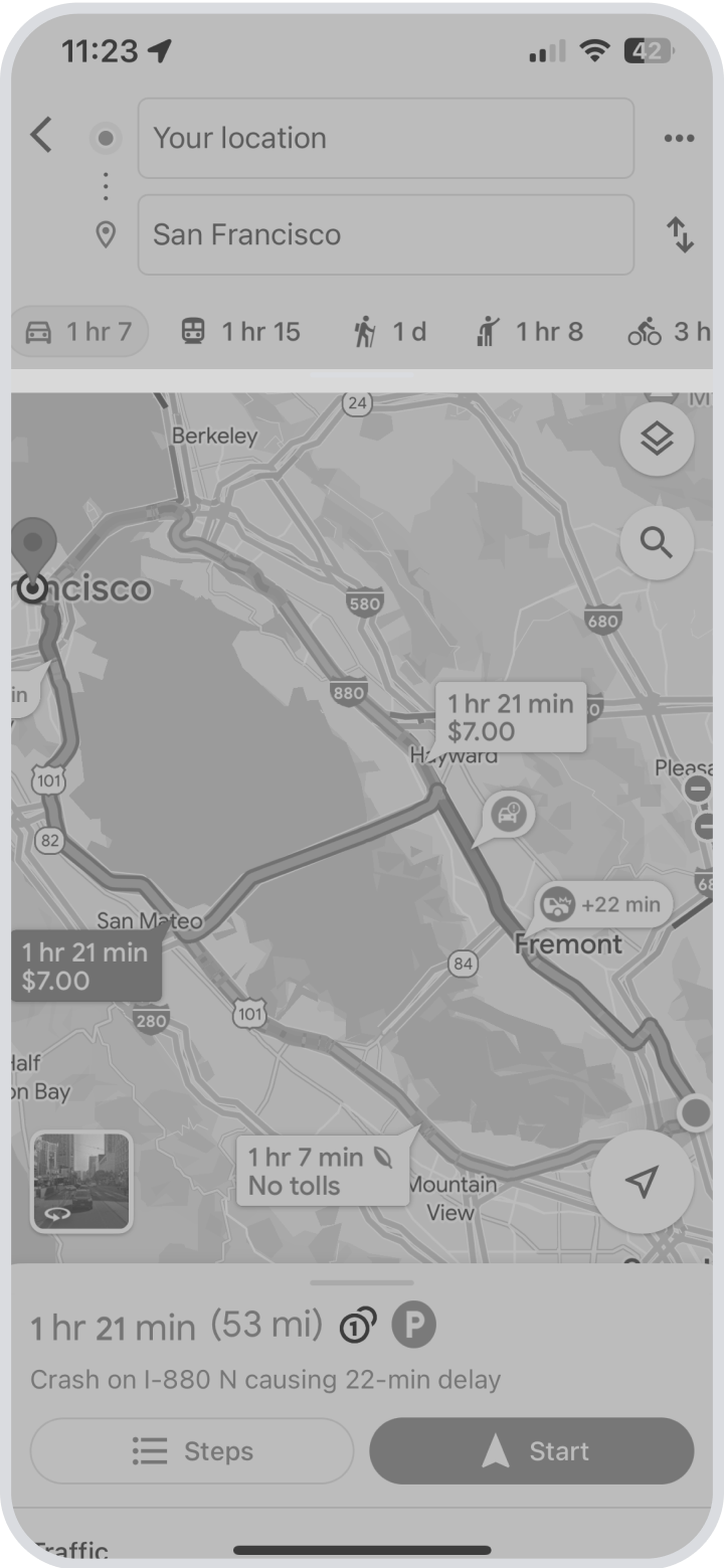
Google Map’s current interface provides one primary data point for each mode of transportation when planning a route, which is based on the duration of travel. When comparing modes of transportation, using time as the determining factor will often result in the prioritization of personal vehicles, which produce the most carbon emissions per mile among all modes of passenger transportation.
The Solution
As a species, we need to be held responsible to practice environmental stewardship for the sake of the planet and for future generations. Accomplishing this starts with informing people of the environmental impacts of the transportation sector, followed by providing opportunities for people to take action on reducing their carbon footprint by changing their transportation habits.
The Wrap Up feature has two primary components. The first is to introduce additional data points to route planning, including cost, carbon emissions, and health. The second is providing the user with a brief summary of their monthly and annual transportation habits to inform them of the impacts of their actions and to provide them opportunities to travel more sustainably.
Google Wrap Up informs users about their environmental impacts and provides opportunities for people to reduce their carbon footprint.
RESEARCH
Understanding current transportation habits
A research plan was developed that included user interviews, online surveys and competitive research. The goal was to understand people’s transportation habits, how they determine which modes of transportation to use, and what existing resources are available to people to route plan and understand the impacts of transportation.
Four participants were interviewed to gain an understanding of their current transportation habits and how they perceived sustainability.
“I want to live more sustainable and I’m conscious of the environment, but I don’t feel like I’m doing much to contribute positively.”

Gathering data to identify trends
A survey was conducted to gather quantifiable data regarding people’s priorities when it came to transportation what might influence them to become more environmentally friendly. 18 participants provided responses to an 8 question survey.

The vast majority use personal vehicles for transportation.
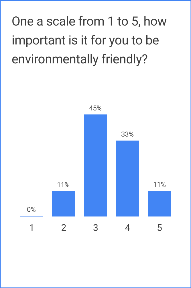
Being environmentally friendly is fairly important.
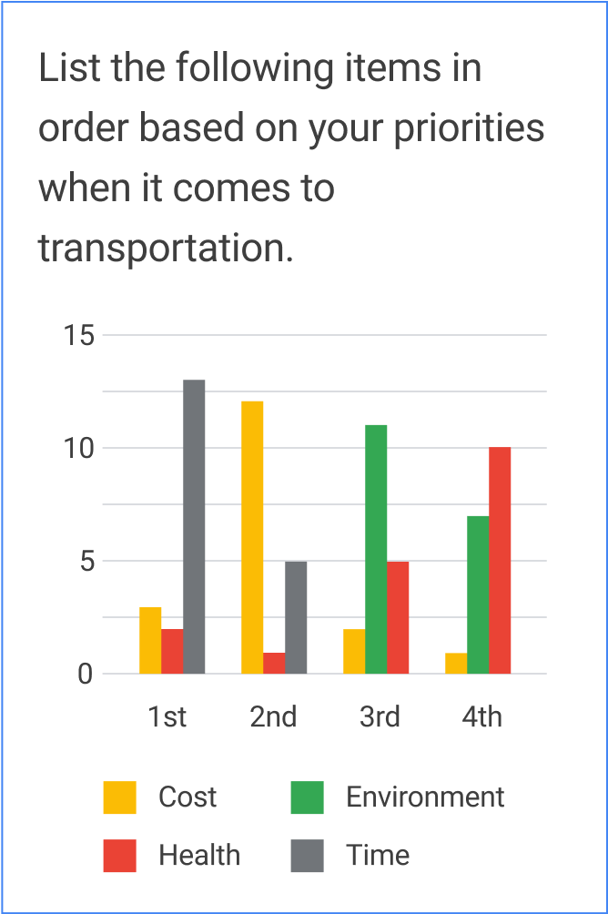
Time is the highest priority, health and the environment are the lowest.
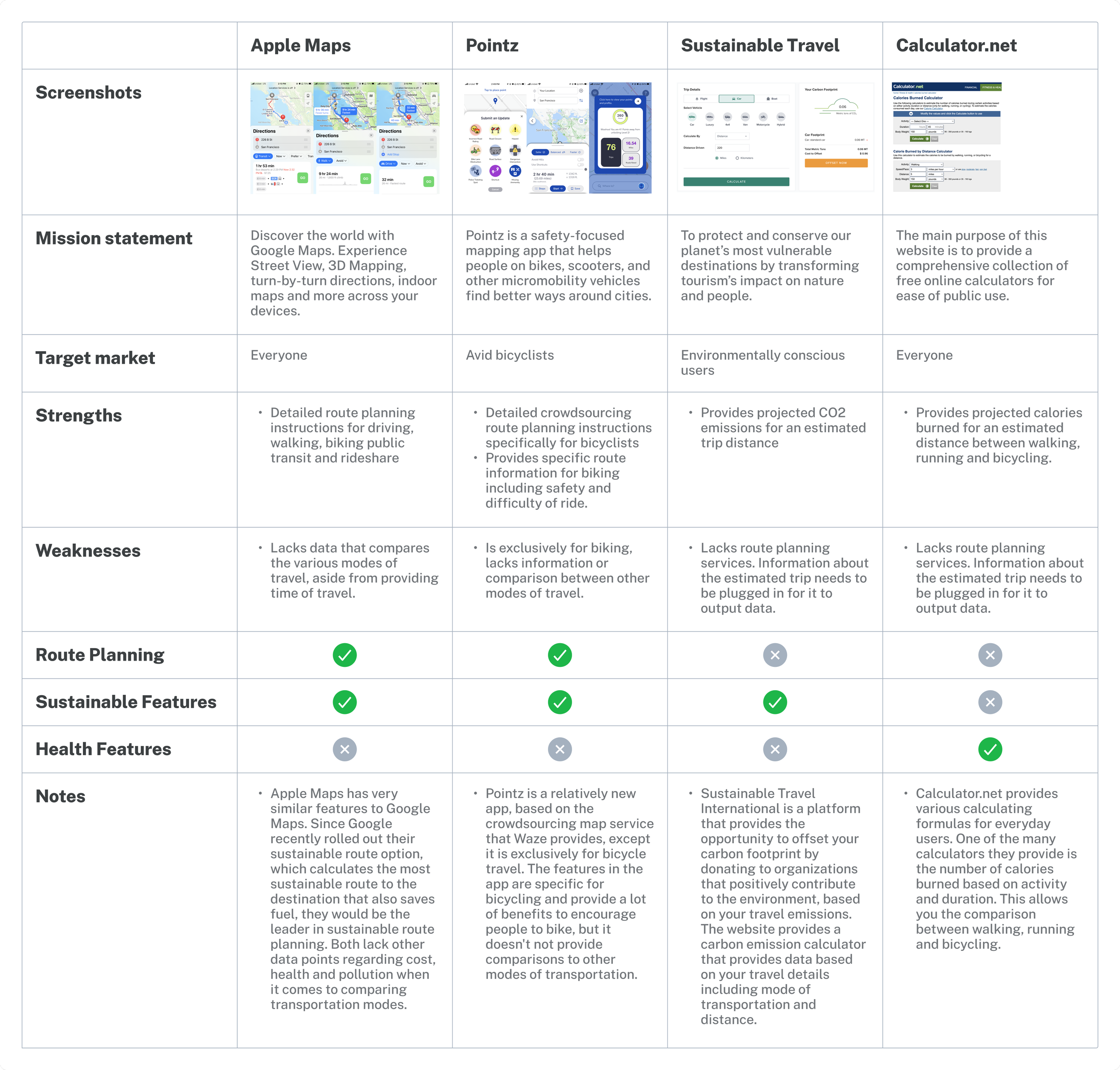
Analyzing competitive products that bring together transportation and sustainability
Competitive products were evaluated to understand what resources were available to understand how personal transportation impacted environmental sustainability. There were few existing products that brought data about both of these topics together.
IDEATION
How might we communicate the benefits of walking, biking and public transit in order to encourage people to choose these modes instead of driving?
Meet Julian, a San Franciscan who is an avid driver that wants to be more environmentally friendly.
To better empathize with the target user, a persona was created that resembled regular drivers who have an interest in becoming more environmentally friendly.

DESIGN
Developing low fidelity wireframes to validate ideas
Low fidelity wireframes were developed verify whether the early stages of conceptual design met the goals of raise environmental awareness and encourage the use of alternative modes of transportation. The new feature would provide additional data points to users who were planning a route, as well communicate updates regarding their transportation habits in a enjoyable and interactive way.
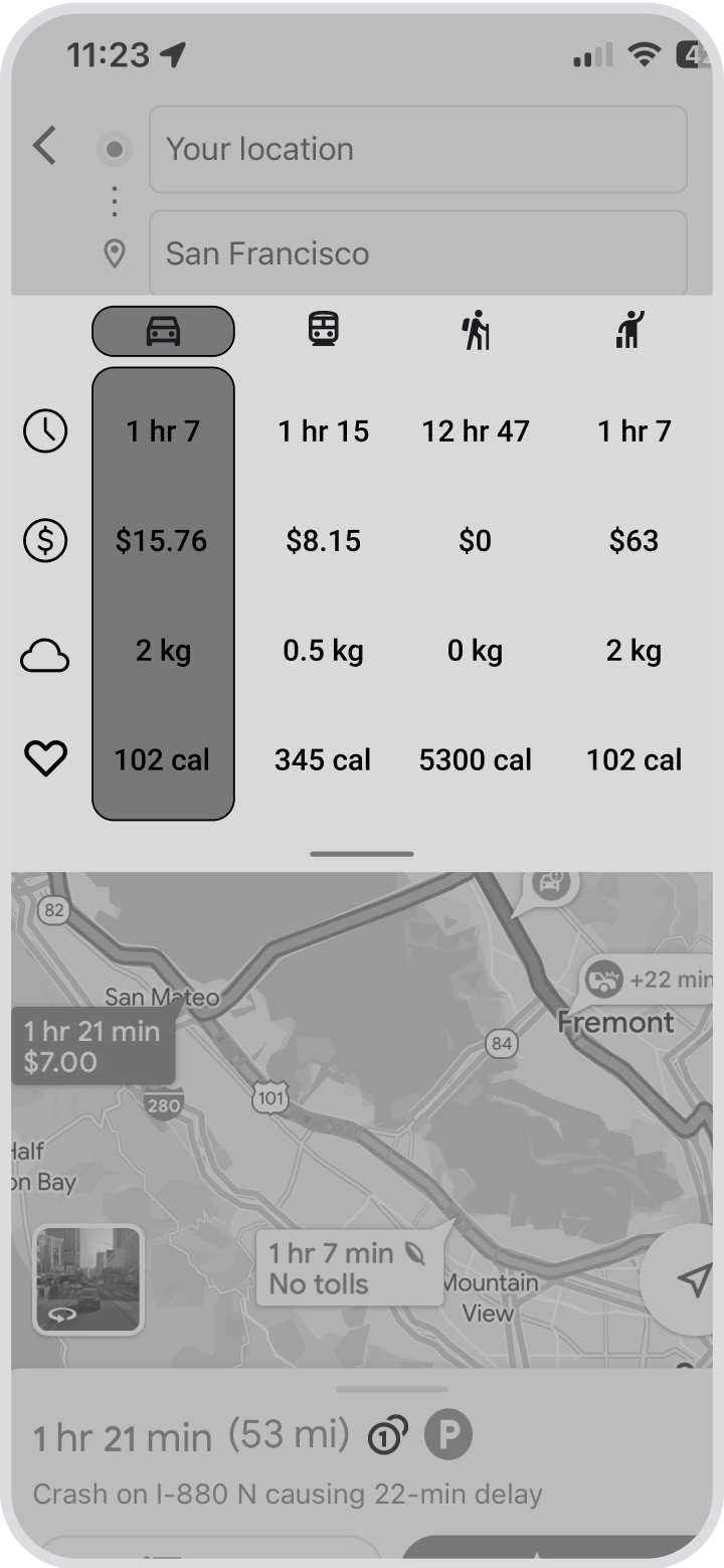
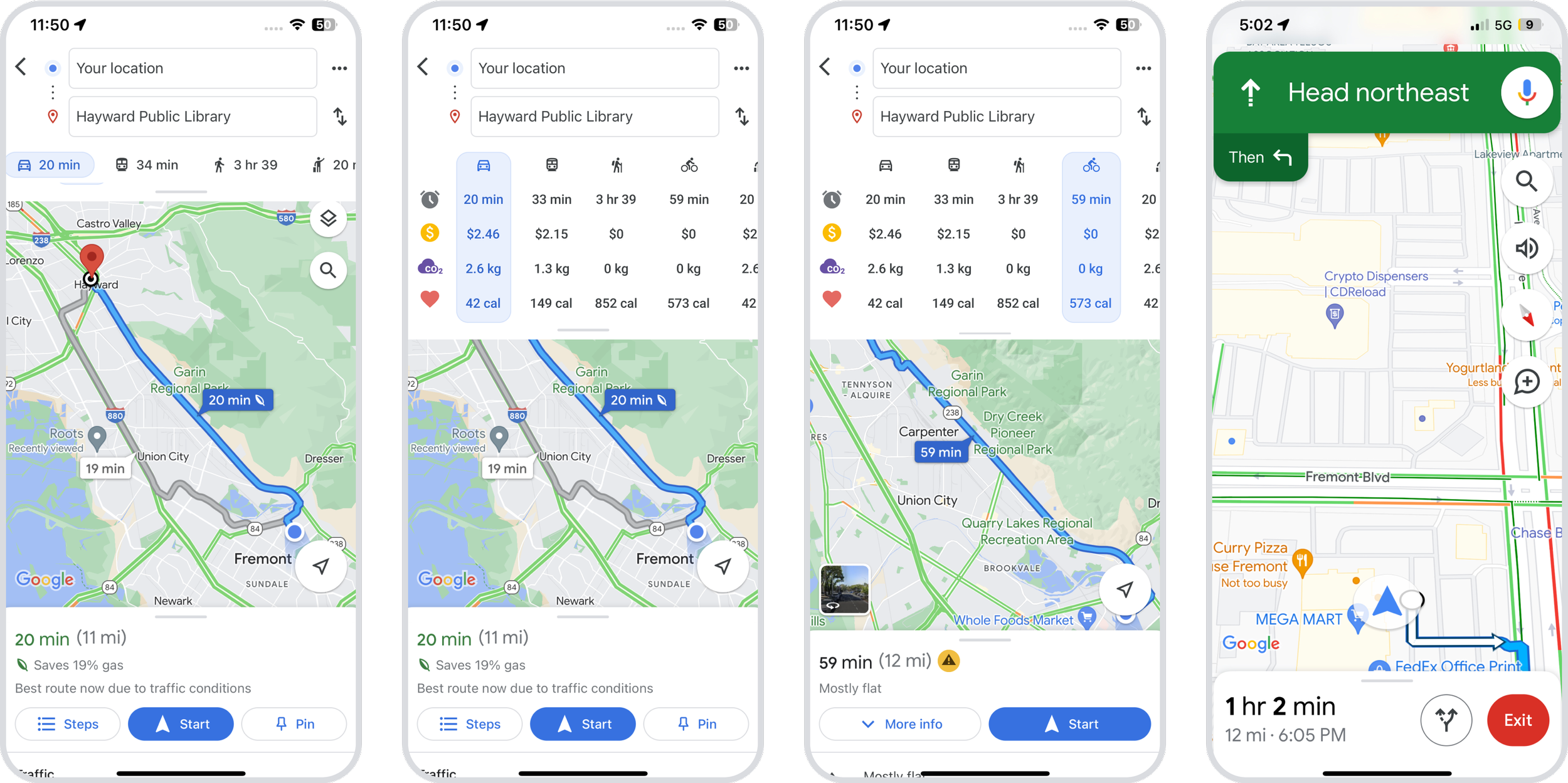
ROUTE PLANNING
The Wrap Up feature provides additional data for planning routes
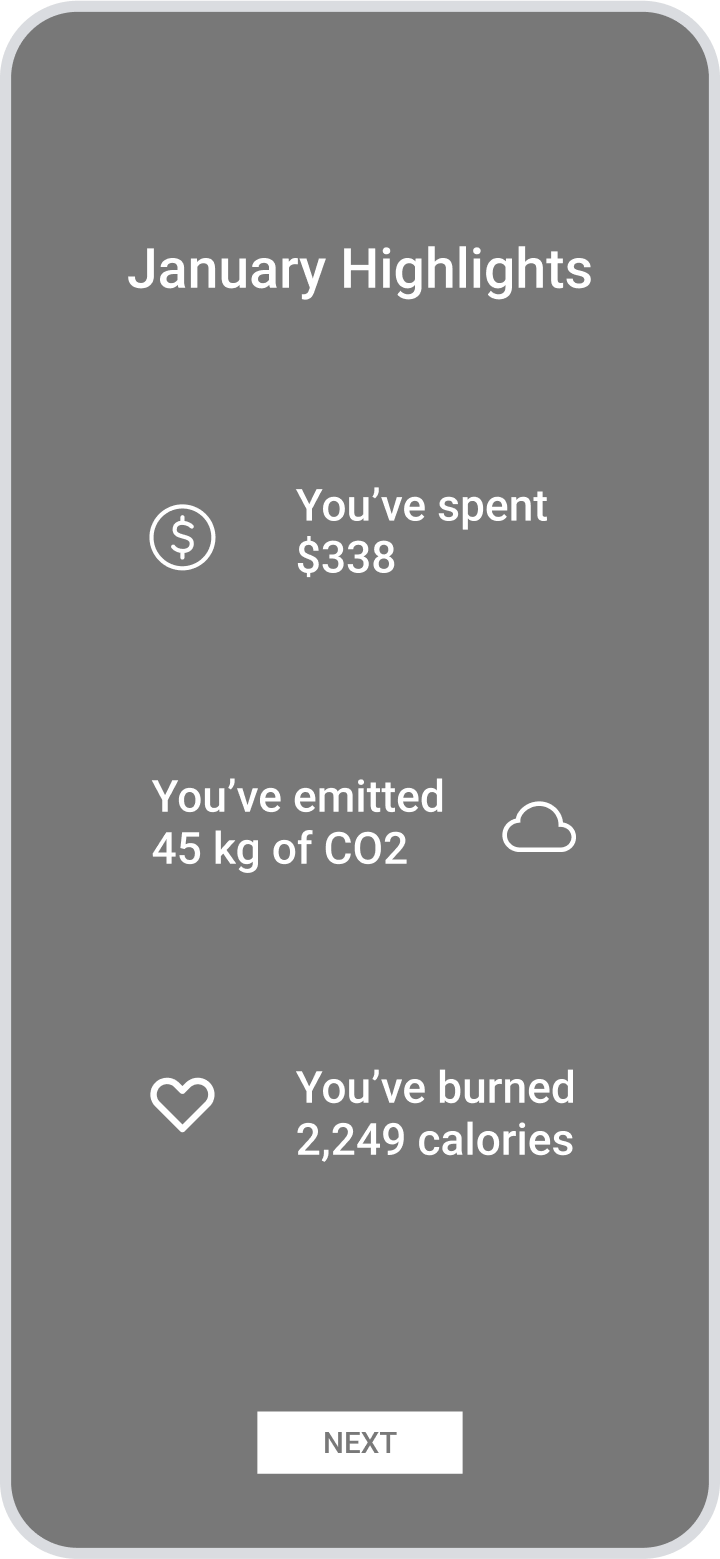
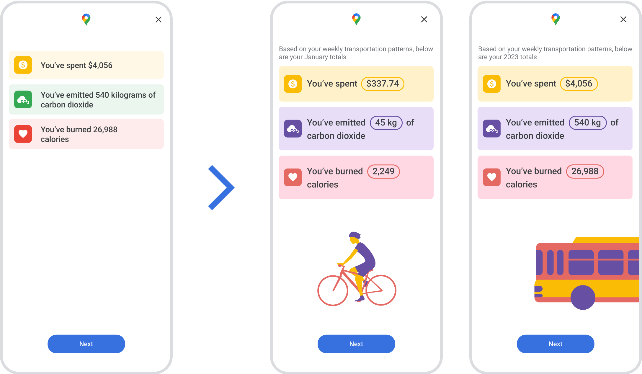
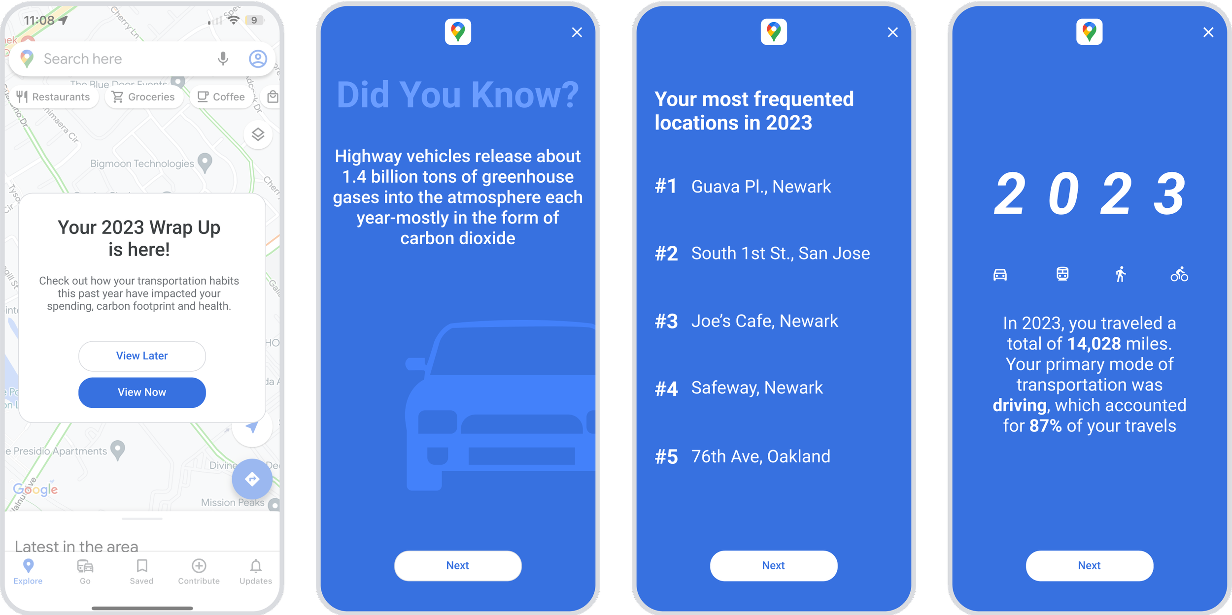
MONTHLY WRAP UP
A monthly recap summarizing the results of a users transportation habits

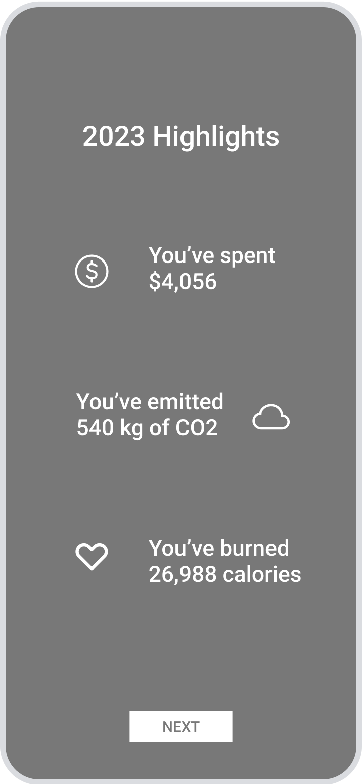
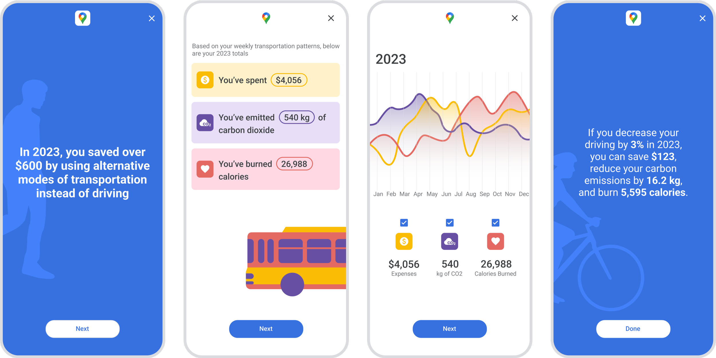
ANNUAL WRAP UP
An annual recap of a users habits.


Testing the feature
User testing was conducted to gather initial feedback about the feature’s design. Below are the primary revisions incorporated to improve user experience.
Being mindful about color selection
I started out designing the new feature using Google’s brand colors. Through testing, I realized users were associating the colors with meaning. Since red is often used as a reference to an error state, and green to success, the colors I used to depict the data symbols weren’t an accurate representation of their meaning.

Using graphics to grab attention
The reality is that, sometimes, data can be boring. A big part of meeting this features goal was to communicate educational information in a fun way. Graphics were added to the wrap ups to help convey the data in an entertaining manner.
Providing flexibility to meet user goals
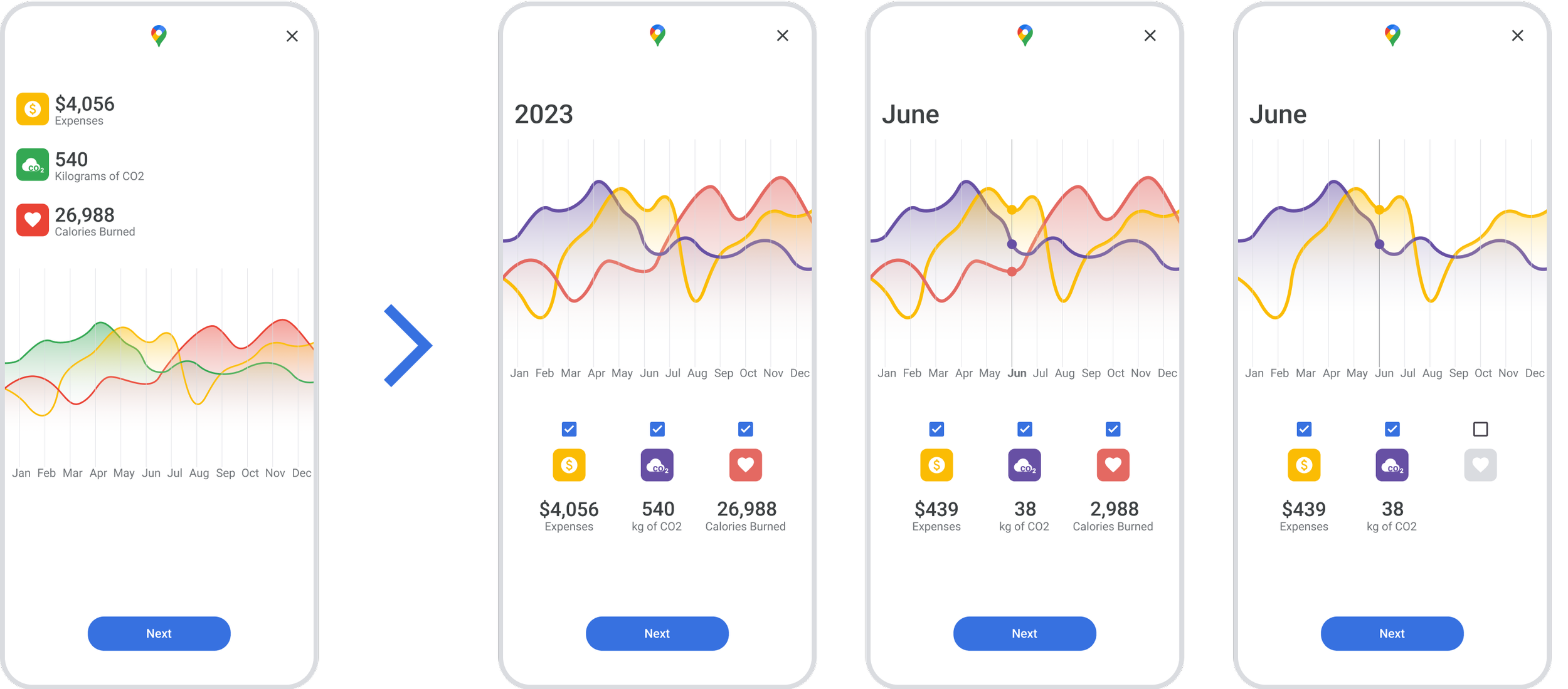
Initially, the annual wrap up providing a screen that identified a users results in all three categories for each month over the entire year. A lot of interest was received on this screen during user testing, and participant’s shared the desire to further explore the data being displayed here. The iteration allows users to see the annual results, and also the results of each month if they touch the graph. It also allows them to filter on and off the various categories in order to focus on certain data points.
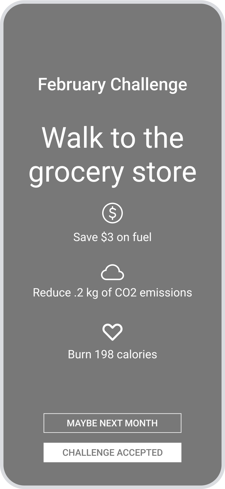
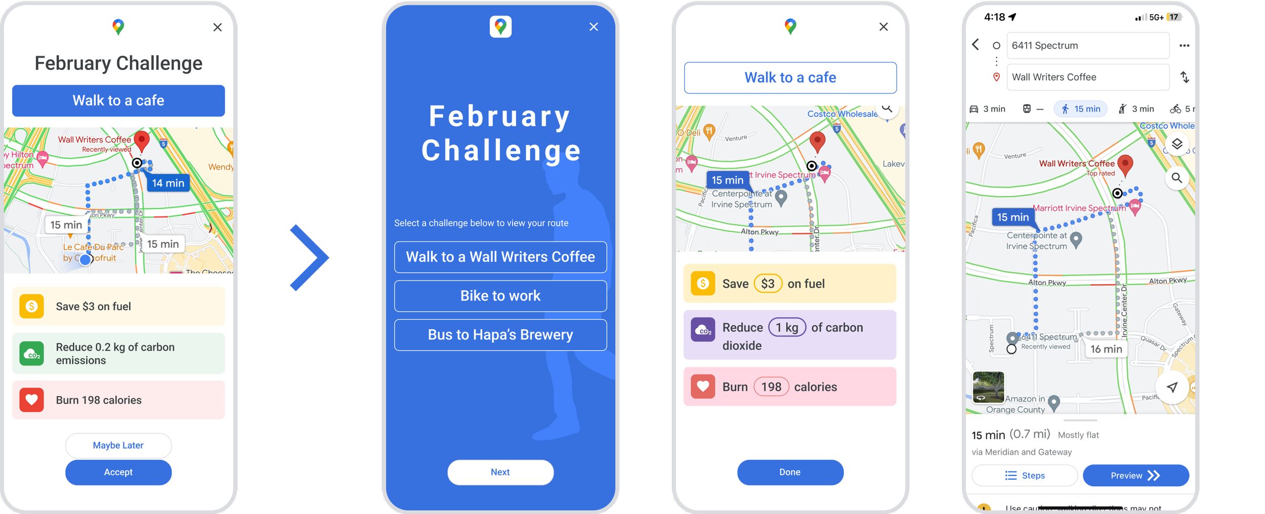
Providing options to stimulate action
The final screen of the wrap up flow initially brought users to a challenge to use an alternative mode of transportation. User testing revealed that users may want more options for this challenge, in case they weren’t interested in the one presented. This would increase the possibility of the user finding the challenge interesting and therefore completing it.
DELIVERY
Final High Fidelity Wireframes
Following user testing and design refinement, the final iterations of high fidelity screens were completed.
Route Planning
Monthly Wrap Up


Annual Wrap Up
REFLECTIONS
Key Learnings
Doing the Research
On the surface, this feature is a fun additional to a regularly used application for functional purposes. But my goal for this feature was to make a positive impact on environmental sustainability. As I began exploring opportunities on what this feature might become, I realized how much research was required to back up the additional data that I intended to communicate to the user. Research in regards to carbon emissions, exercise and transportation costs became an essential component for educating users and the hope that it would lead to raising awareness and taking action.
Engaging Users with Data
The primary goal of the wrap up feature was to communicate data to the user to raise awareness. As I became immersed with the research and findings, I forgot that data alone can be boring. User testing for this project was enlightening as I received feedback that the information I was presenting was really valuable, but there were opportunities to make it more interesting. I then explored various design approaches to incorporate animations, increase interactions and add visual interest to each screen.