
Clay Planet
Redesigning a ceramic store’s website to improve site navigation, product organization and responsive design
OVERVIEW
Clay Planet is a business that sells ceramic supplies with a need for a website redesign to improve usability with the goal of increasing sales and enhancing customer experience.
SECTOR
Ecommerce
DURATION
8 weeks
MY ROLE
User Research
Usability Testing
UI/UX Design
Prototyping
The Problem
Clay Planet’s current online store lacks product organization and visual hierarchy, delivering a sensory overload to shoppers. In addition, the website is not responsive, which makes browsing challenging especially for mobile users.
The Solution
A research-based redesign that reorganizes the store’s product categorization.
A responsive website design compatible with desktop and mobile to improve usability and accessibility.
A user interface design that presents content in a purposeful and efficient manner to improve navigation and communicate information clearly.
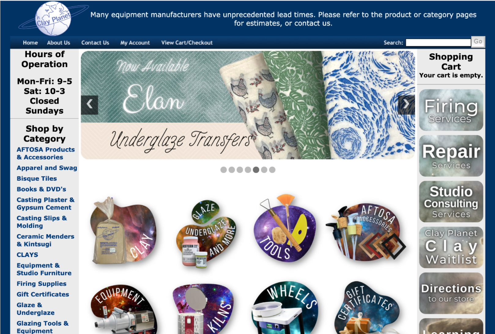
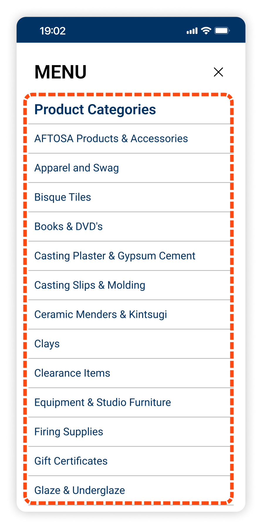
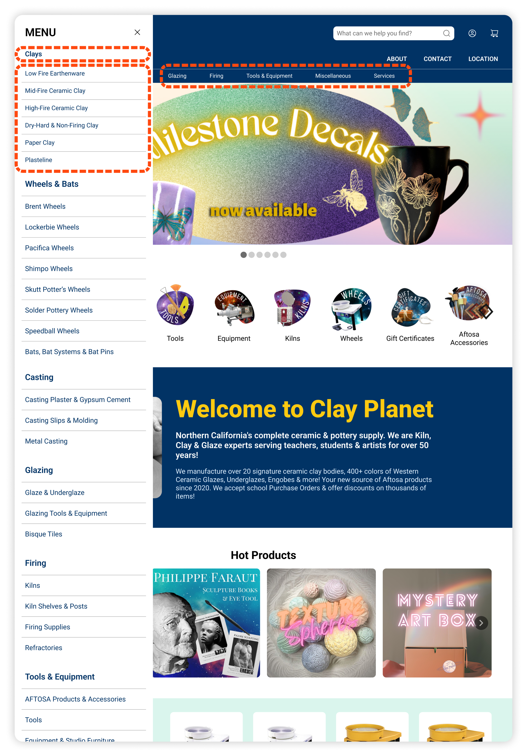
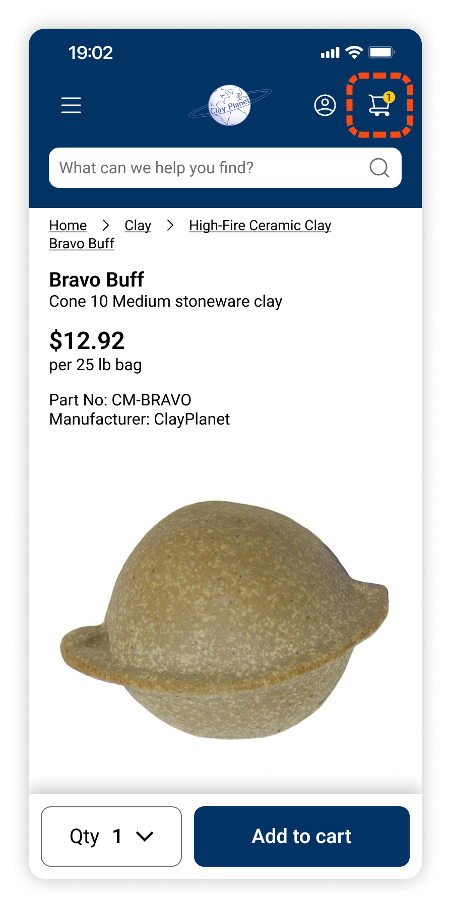
BEFORE
Clay Planet’s original online storefront

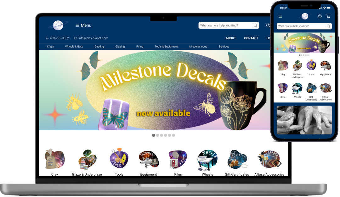
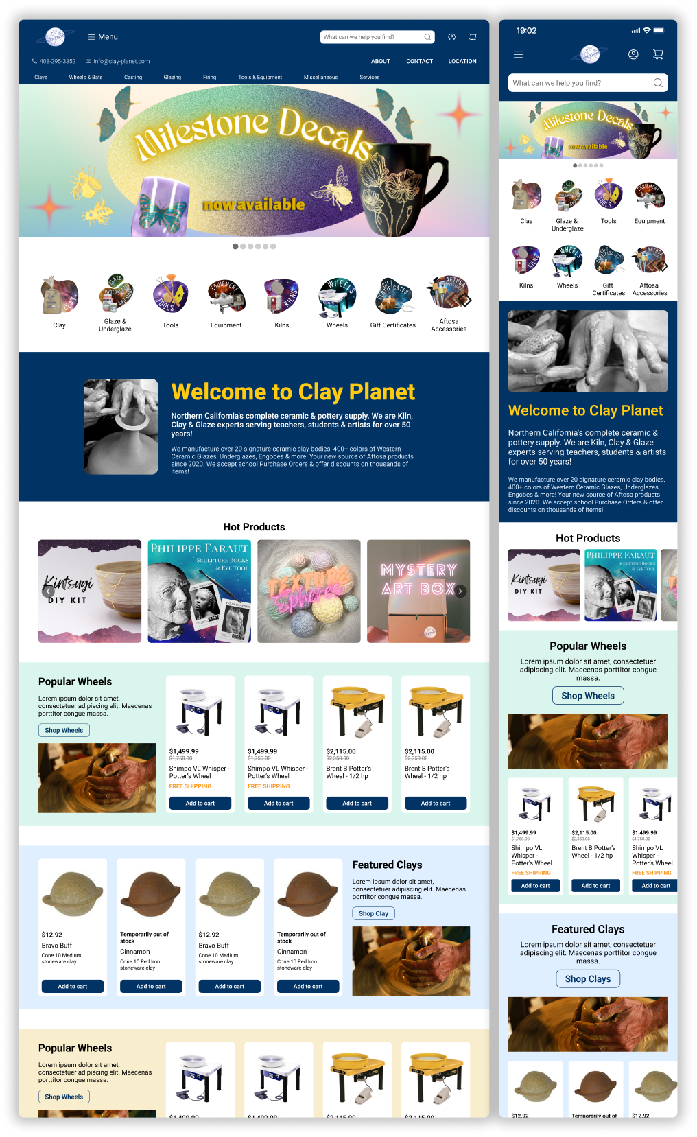
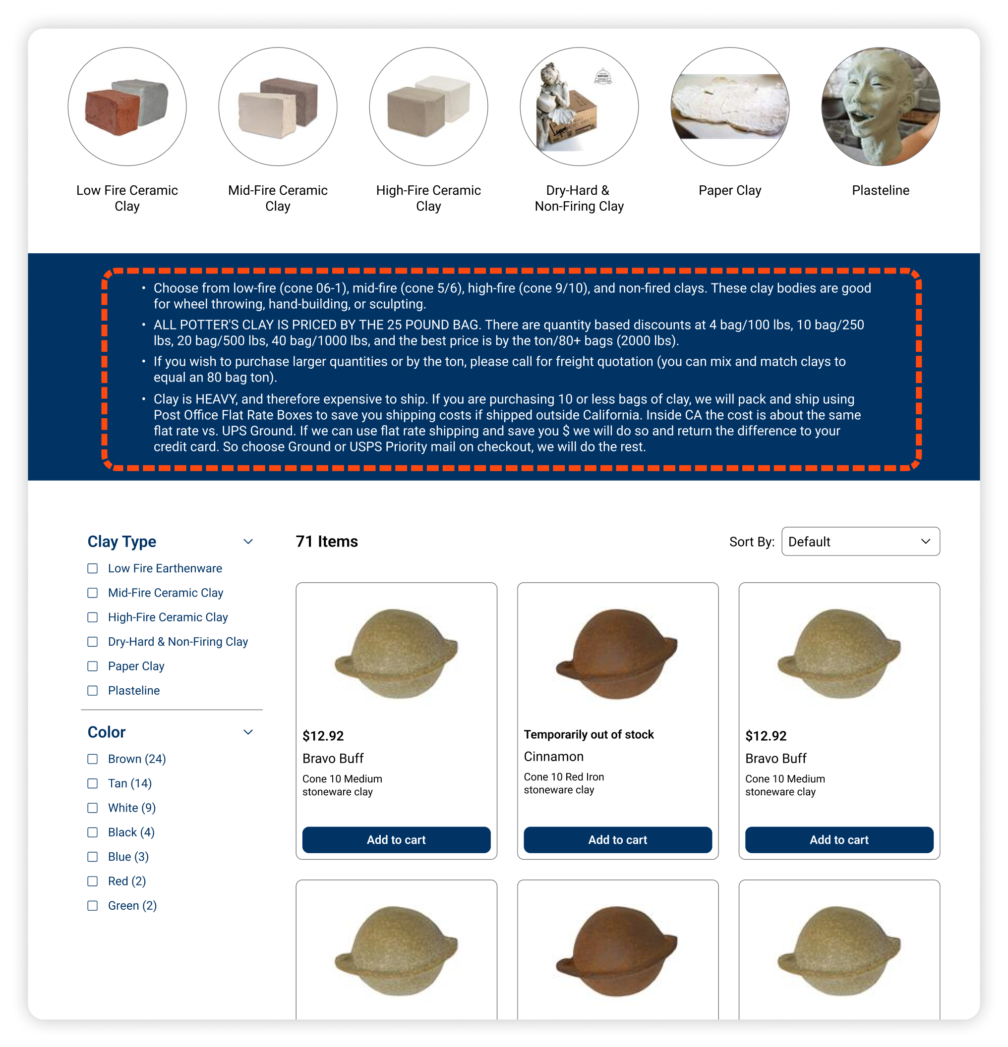
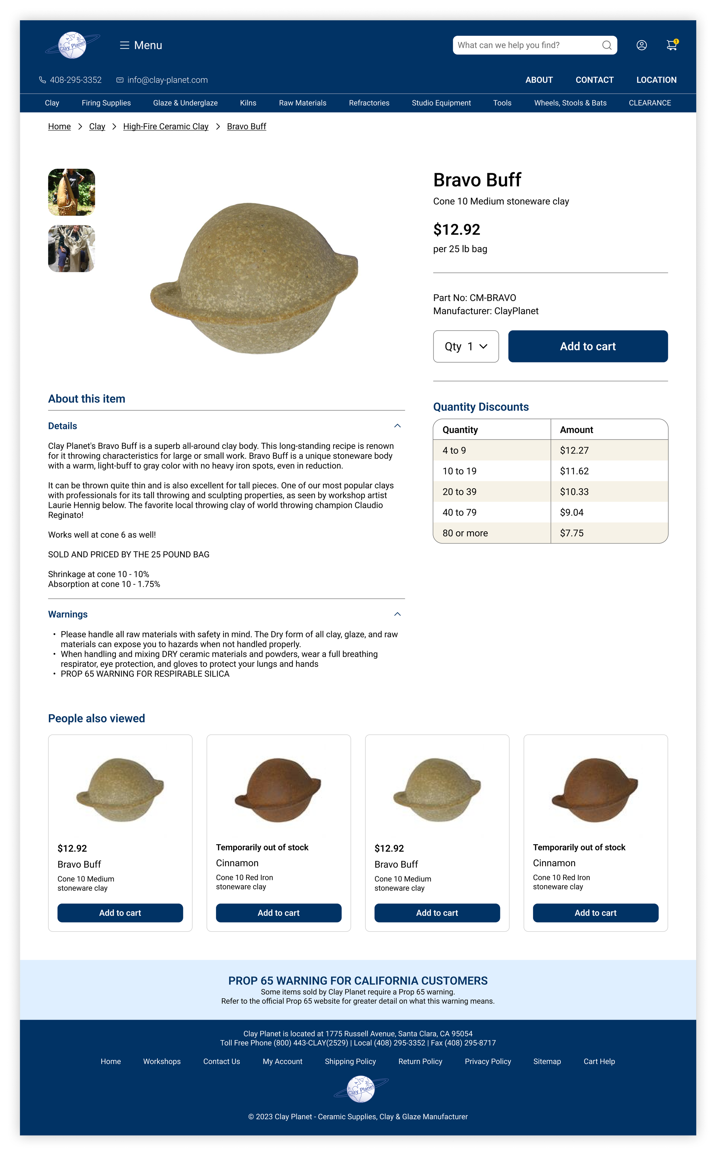
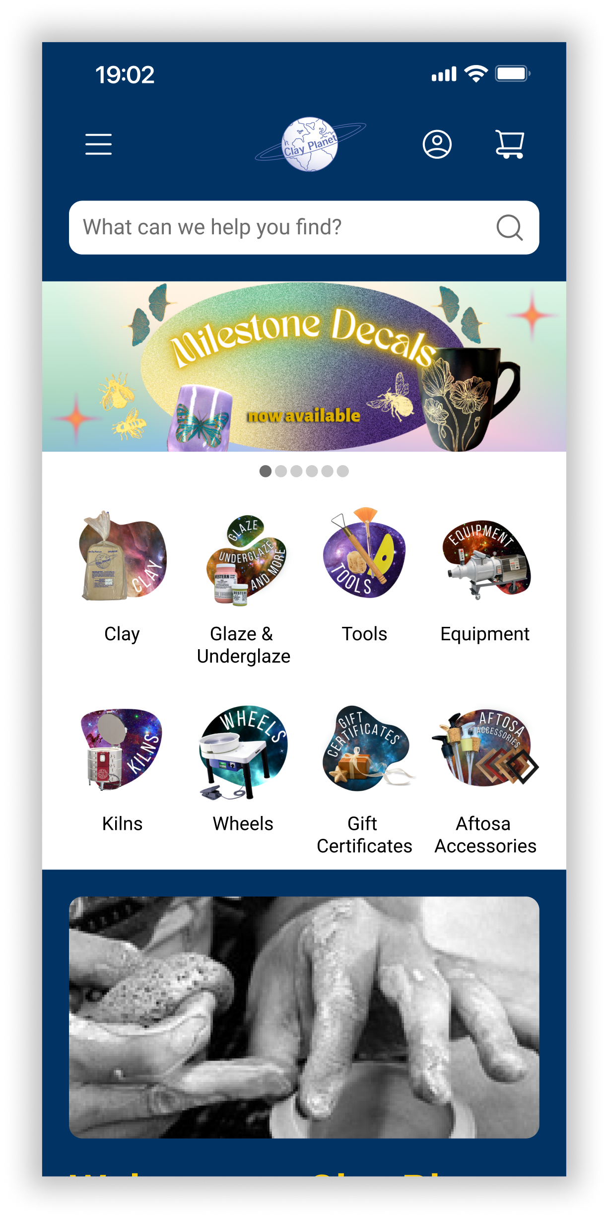
AFTER
Final iteration of the website’s redesign
RESEARCH
Understanding the customer base
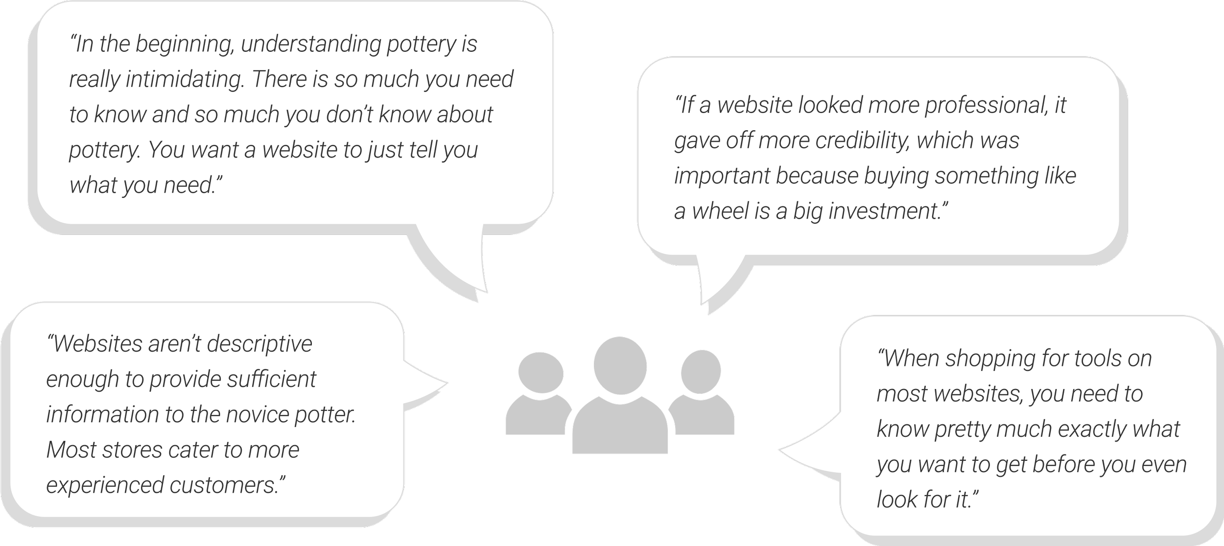
I wanted to identify the challenges that potter’s were experiencing and the potential opportunities that could improve their workflow. Becoming informed about a potter’s needs would allow me to develop solutions that were suitable to this specific user. A combination of in-person and virtual interviews were conducted with potters with varying levels of experience.
Analyzing competitor pottery stores
Competitive analysis was conducted to understanding how other ecommerce ceramic stores were structuring their website and categorizing their products compared to Clay Planet’s current design. Through the analysis, I discovered that the majority of ceramic supply stores were generally small businesses with a niche market and didn’t have the resources to invest in their website.
Clay Planet
Creative theming
Learning resources for novice potters
Screens provided to navigate through the site are logical.
Home page overwhelming
Objects are disproportional
Columns on the left and right are distracting
Products are categorized by different companies, rather than product types.
Bailey Ceramic
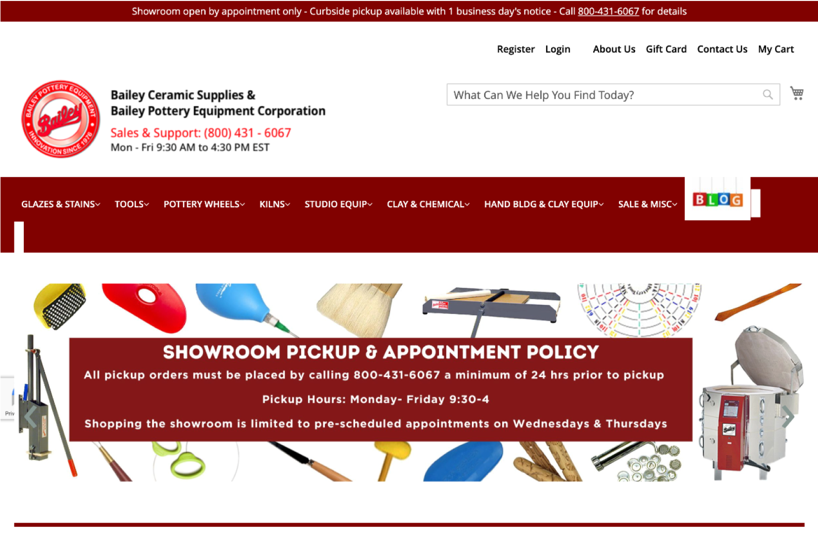
Top bar navigation with drop downs makes it easy to navigate
Tutorial videos
Featured products on the home page seem out of place
Drop down for products requires scrolling
Ceramic Shop

Clear and organized navigation menu
Detailed search bar capabilities
Includes videos
Resources are well organized and specific
Limited descriptions provided for products
Clay King

Helpful descriptions are provided for product categories
Visually outdated
Low resolution graphicsHome page is chaotic
Layout of products is not consistent
Identifying opportunities in the existing design
Following user interviews and reviewing competitor websites, a heuristic analysis was conducted on Clay Planet’s current website to identify opportunities and constraints in the design.

IDEATION
How might we help potters understand what they need, identify what to buy, and provide them the confidence to make their purchase?
Creating personas to understand the user
Based on user research and client discussions, two user personas were developed to represent the range of pottery experience within the target customers.


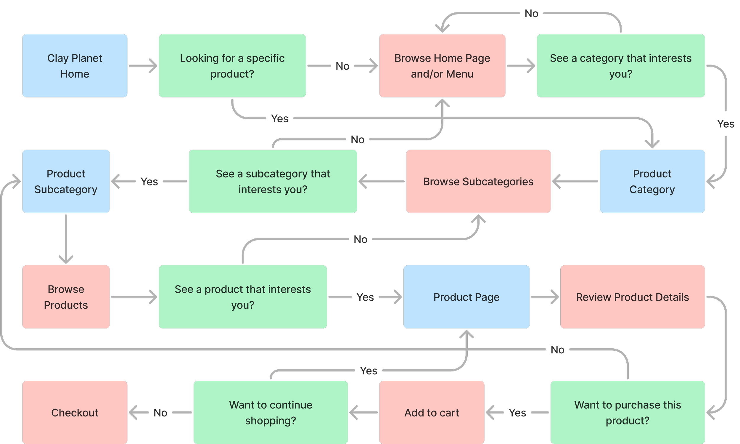
Exploring the decision-making process of shopping
Online shopping involves multiple layers of decision-making as the user narrows down the product categories in order to identify the item they are interested in purchasing. This makes organized categorization and intuitive site navigation essential for a successful online shopping experience.
DESIGN
Mocking up major changes
Low fidelity wireframes were developed to communicate the more significant changes that were proposed for the redesign. This was especially important in order to review and receive approval from the client prior to proceeding with high fidelity screens. Navigation options on the home page were consolidated to provide the user with a single location to access product categories.

Testing the redesign
User testing was conducted to confirm whether the redesign met user needs. Positive feedback was received from both users and the client, though there was still room for improvement for product categorization. Further exploration with users was conducted to help identify intuitive subcategories for the vast product types available.
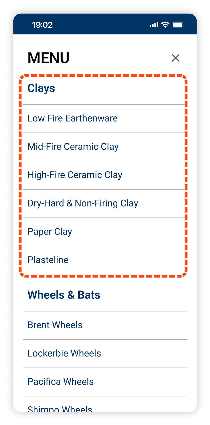
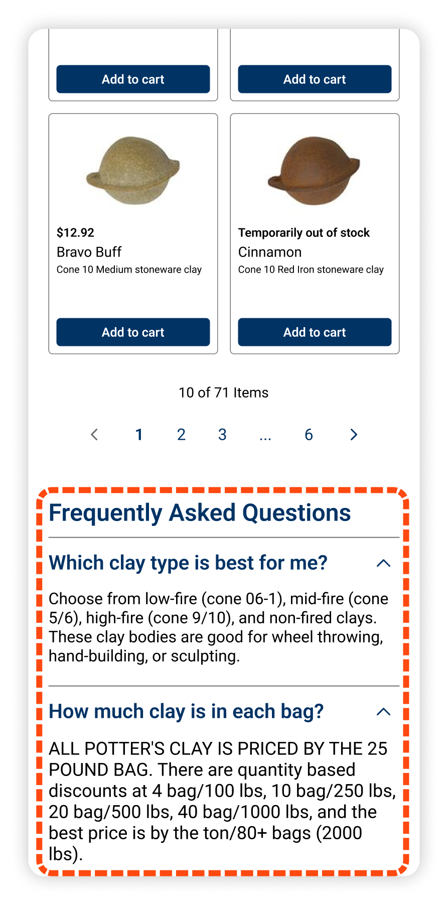
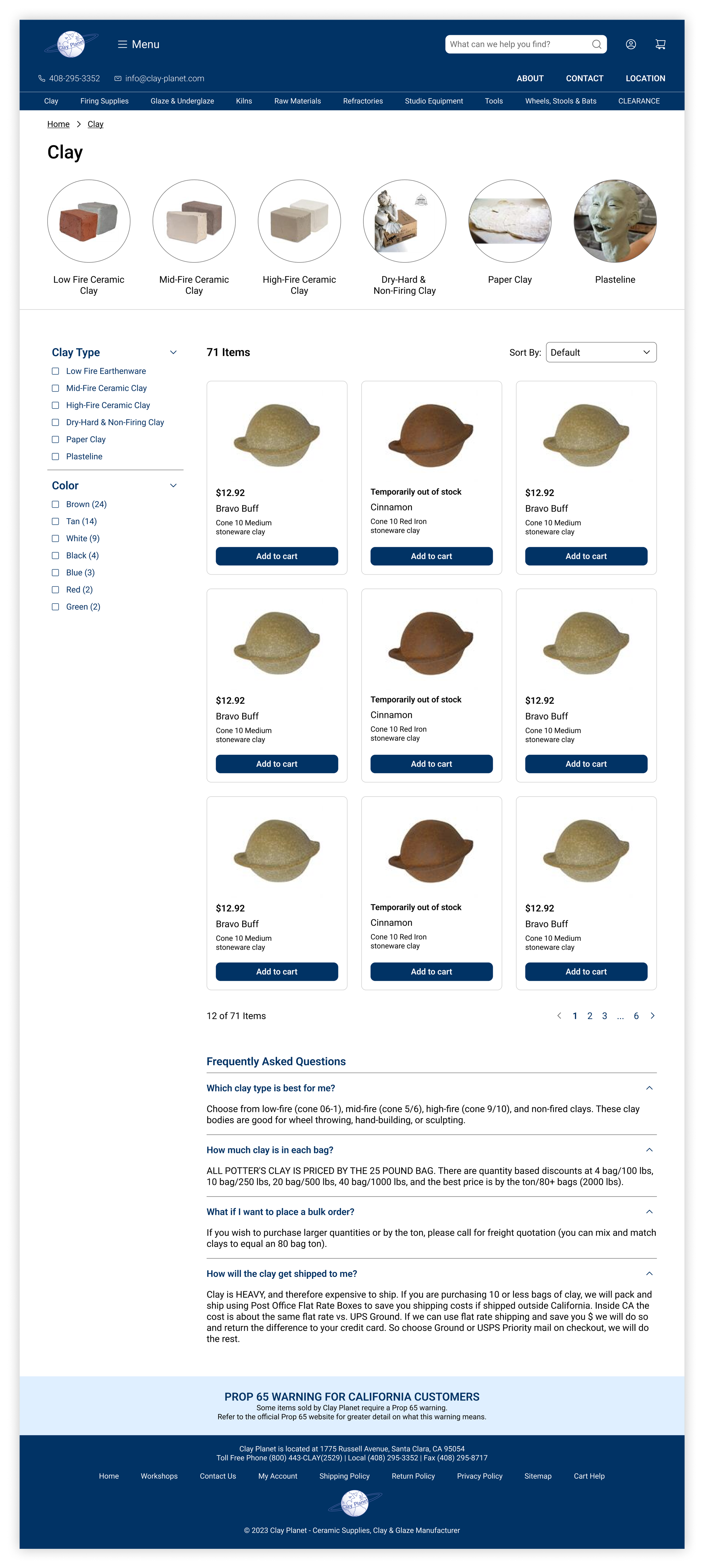
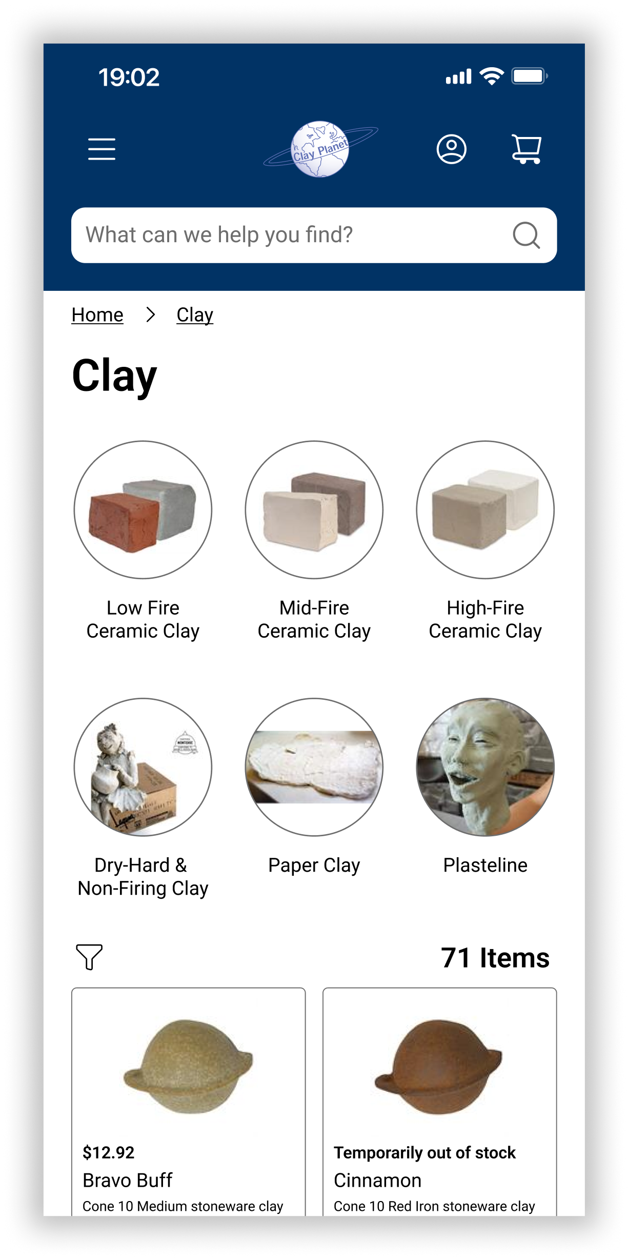
Organizing product subcategories to ease site navigation
BEFORE
Users found the vast number of categories challenging. The available categories in the top bar menu led to confusion regarding why some categories were displayed and not others.
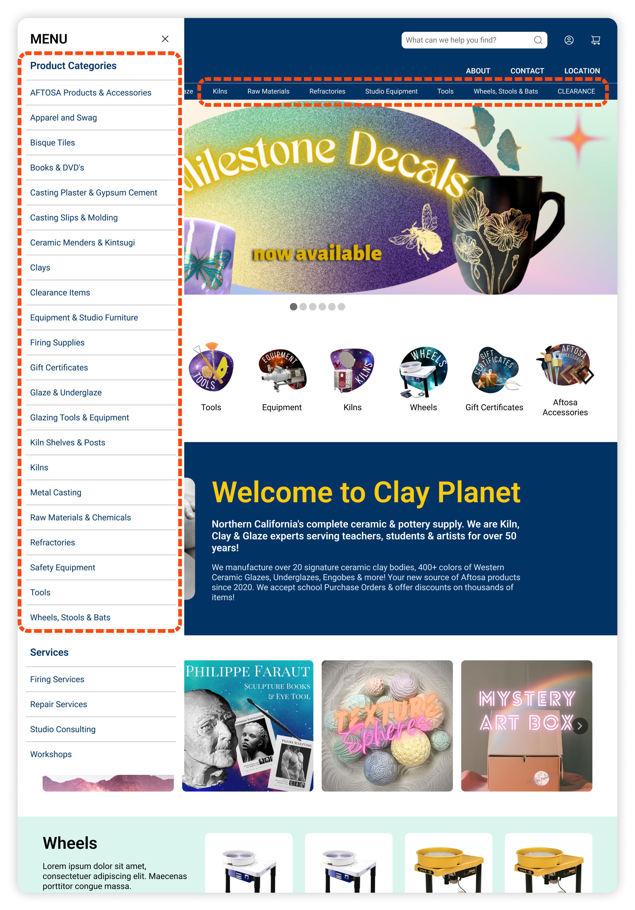
AFTER
Following a number of card sorting exercises, the products in the menu were subcategorized based on the related ceramic activity. The top bar categories were revised to reflect the title of each primary category and each made into drop down menus.
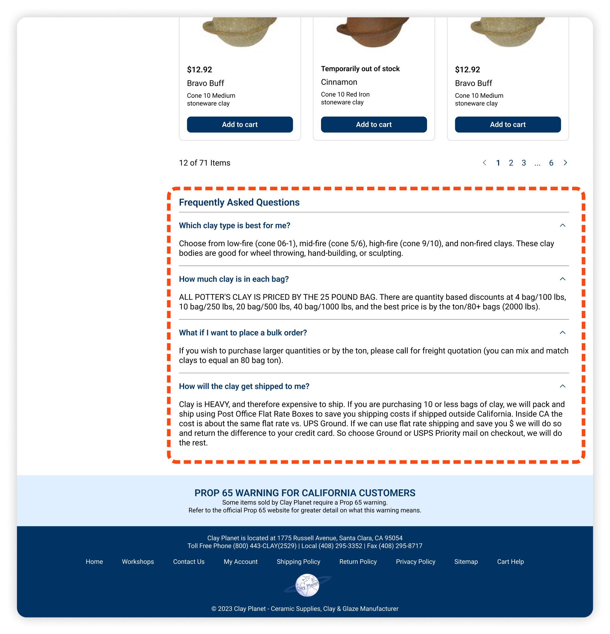
Presenting information to improve legibility
BEFORE
The lengthly paragraph of text led to many users to skip over the information and then struggle to locate that information later on.

AFTER
The text bullets were reorganized into clear categories of frequently asked questions to help the user quickly identify the topics of information being provided.
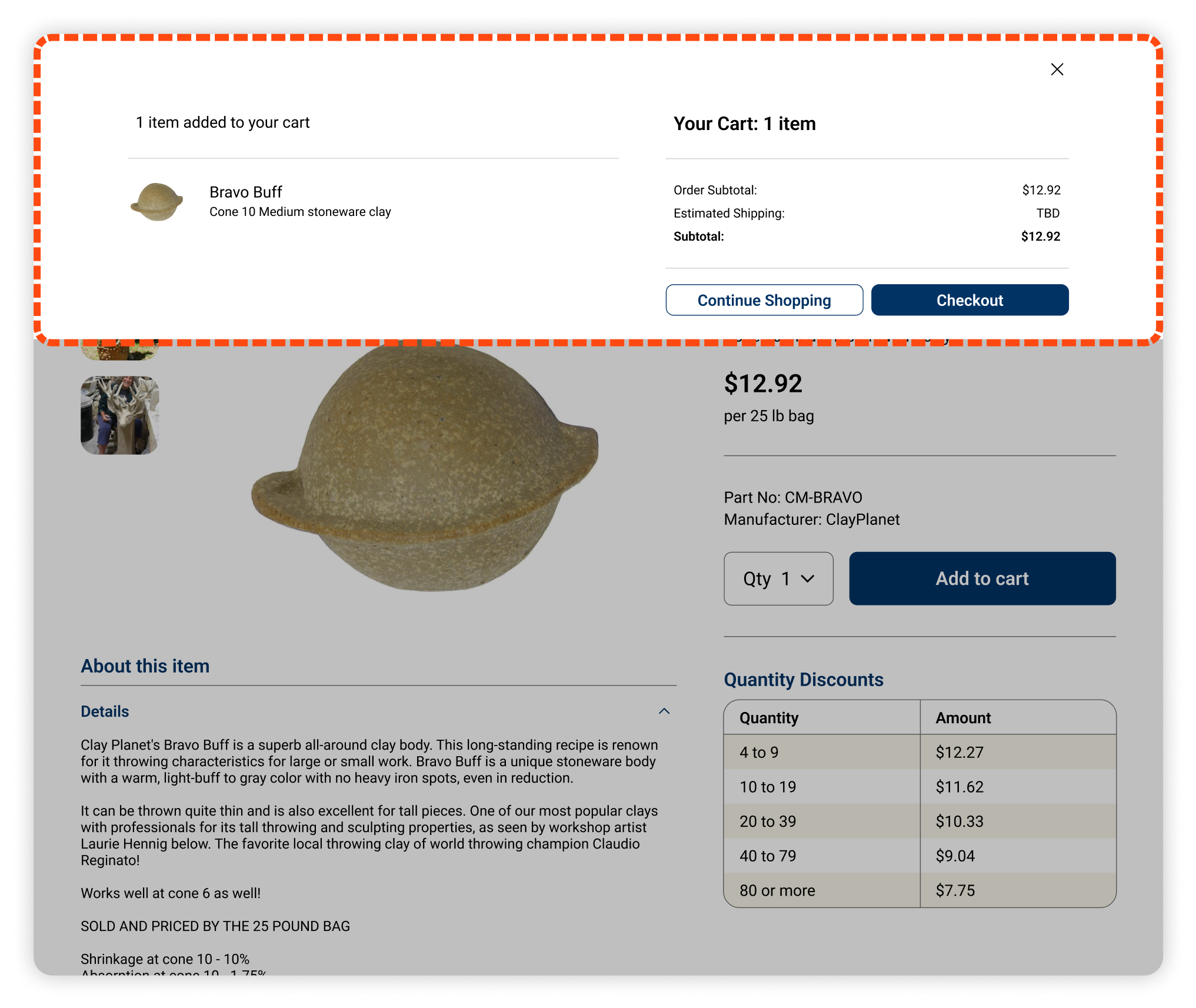
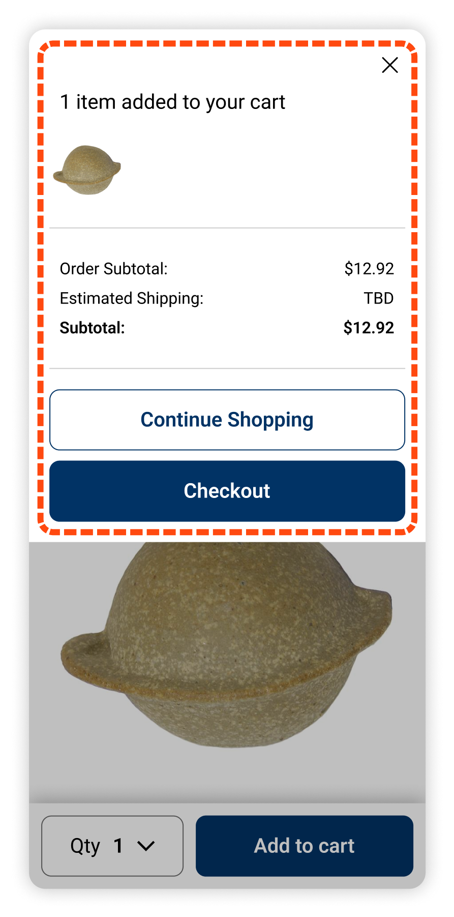
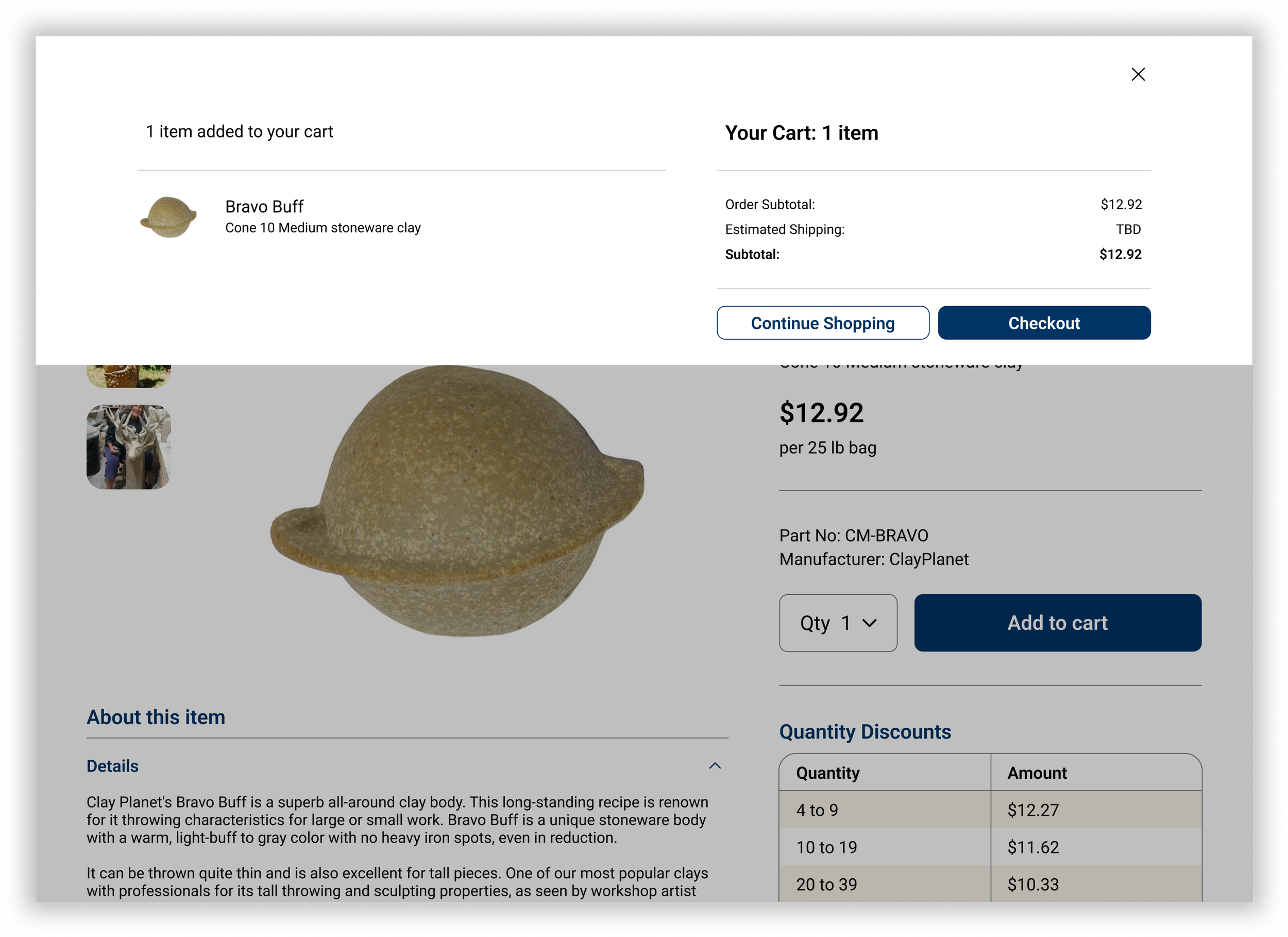
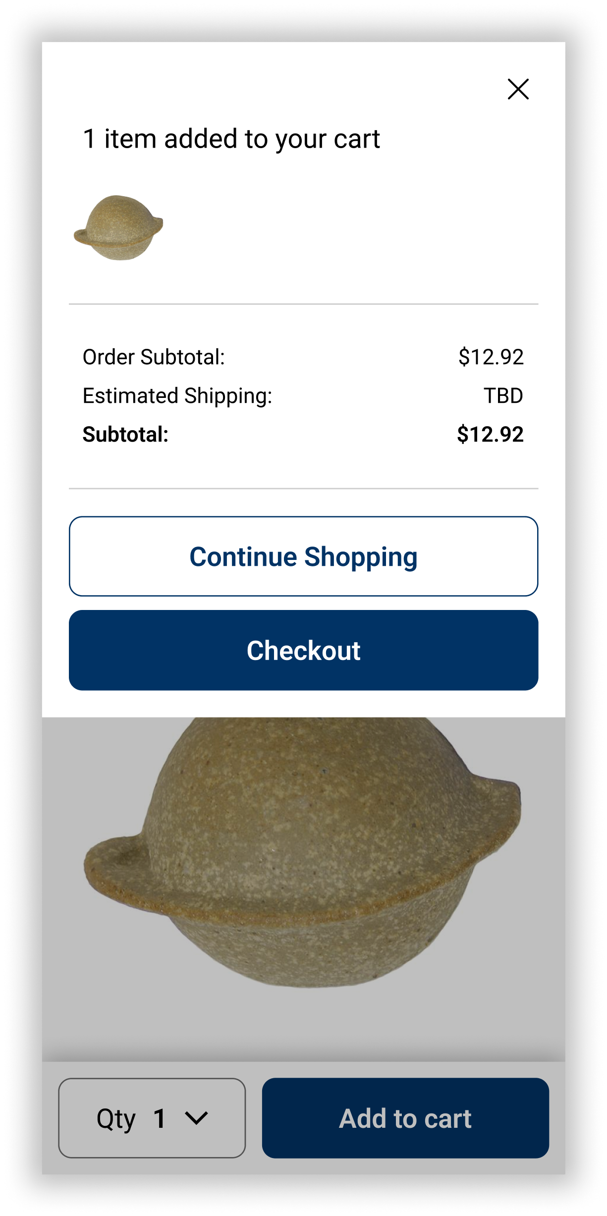
Communicating positive feedback for completing tasks
BEFORE
Users found that the cart icon showing quantity was not sufficient feedback to communicate the item has been added to cart.
AFTER
A pop up at the top of the page was used to clearly communicate the successful completion of adding an item to the users cart.
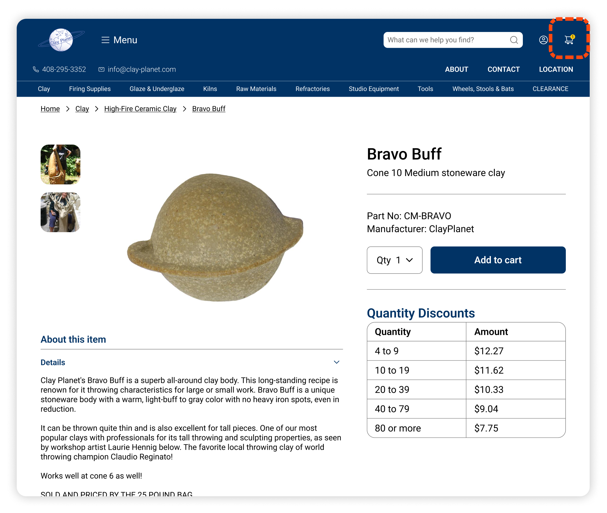
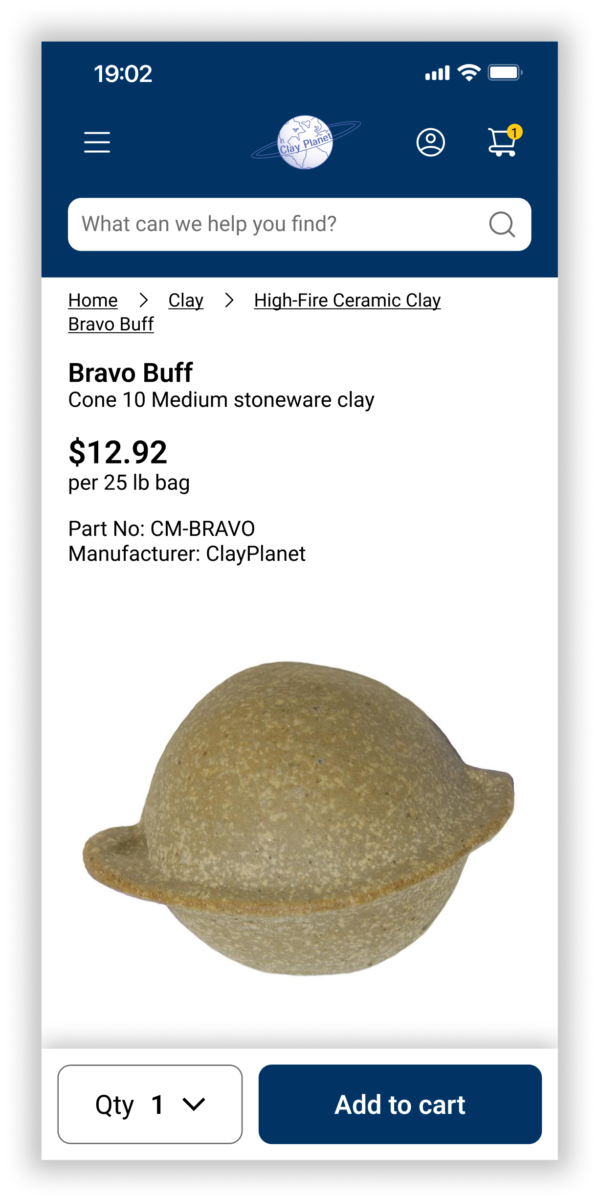
Final High Fidelity Wireframes
Following the iterations made from input received by the client and during usability testing, the final website screens were handed off to the client.


REFLECTIONS
Key Learnings
Being Flexible with Clients
Working with a client on a redesign involves recognizing the constraints such as the platform that was used to build the existing website and the limitations it may have, and what the client is willing to change about the existing design and what they prefer to preserve.
Researching Niche Markets
Developing a product for a specific user group like potters, which I didn’t have any previous experience with, demonstrated how thorough research is essential for a successful product. I discovered how critical listening and learning from users was to the design process.
Next Steps
The redesign has been successfully handed off to the client, who will proceed with incorporating the design for the home page, product category pages, and specific product pages. Below are opportunities to further improve the online presence of Clay Planet’s business.
Checkout Process
During initial meetings with the client, I learned there were various constraints with the website’s building platform, Network Solutions. It was determined that as a part of this project, the checkout process wouldn’t be included due to the limitations the platform had in changing the design of these screens. The checkout process has a lot of room for improvement and this would be a valuable redesign to pursue in the future.
Brand Loyalty
The current website does provide the ability for users to create an account. I learned from the client there weren’t many incentives to create an account aside from viewing one’s order history. This is an opportunity to develop a program that rewards members and supports returning customers.