
CM Room
Creating a project management software that provides clear progress reporting, effective communication techniques, and innovative task management tools.
OVERVIEW
CM Room is a project management software for architectural, engineering and construction (AEC) services that was created after identifying various shortcomings in existing tools used in the industry.
Problem
One of the biggest challenges within project management in the AEC industry is the difficulty for various consultants to track progress between scope, schedule and budget, and to correspond efficiently and transparently within the project team.
Solution
CM Room provides features that improve progress tracking and communication by identifying opportunities in existing project management software and developing and testing ideas to produce effective solutions.
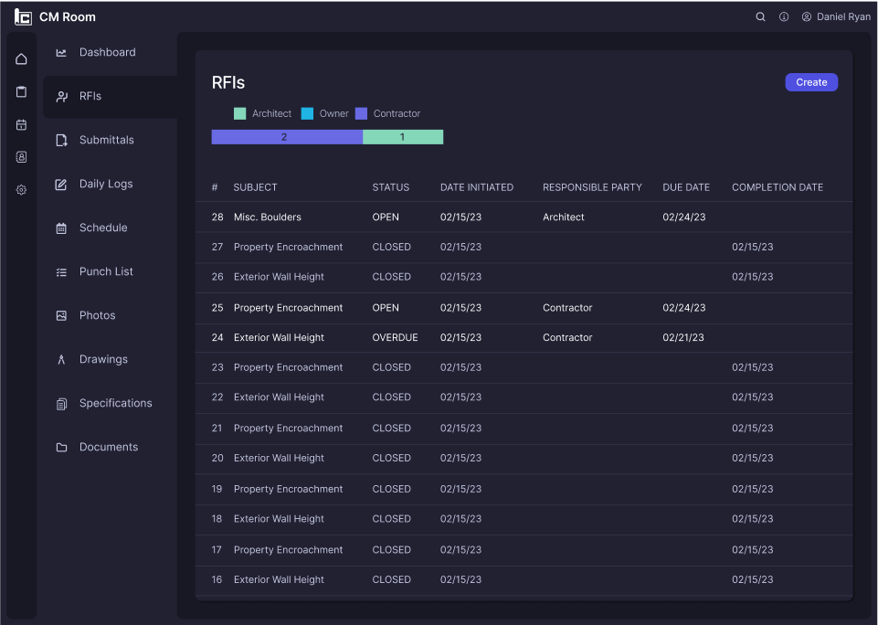
A detailed task matrix that clearly identifies action items for each responsible party.

A comprehensive project dashboard that makes progress tracking easy

A user-friendly response tool to ensure clear communication between team members.

RESEARCH
Identifying pain points found in current tools
User interviews were conducted with architects and engineers to understand the various types of project management products were commonly used in the industry and also to identify the pain points experienced with each of those products.
“A lot of the time, the contractor will call me while they’re on-site and try to explain and describe a detail on the drawings or a site condition and I can’t understand what’s going on and therefore can’t provide a solution for them.”
-Architect from San Francisco, CA
USER GOALS
Ability to share ideas and designs with select parties, while keeping other parties from seeing the correspondence before the solution is ready.
Being able to easily check who’s responsibility it is and when they’re supposed to complete their task by.
A single product for file sharing, file management, correspondence and decision documentation so when questions arise later in the project, identifying the background behind design decisions is made easy.
COMMON PAIN POINTS
Multiple parties working on a solution or response due to lack of communication resulting in wasted time and effort.
Inability to share images or drawings of the item that is being discussed due to correspondence being through phone calls, texts.
Unorganized record of communication within the project management software especially when there is a huge amount of correspondence that takes place throughout the duration of the project.
Analyzing existing AEC project management products
A critical component of the research phase was to thoroughly understand other AEC project management products on the market and identify the tools they offer and how they are effective, along with their shortcomings and potential opportunities for improvement. In order to develop CM Room as an improved product, existing products had to be thoroughly research to avoid creating just another project management tool.
IDEATION
How might we provide a tool for professionals to communicate and record decisions across a single platform?
Creating personas to understand the user
Based on user interviews and competitive research, two user personas were developed to represent the varying professionals on a project that would be utilizing the product.
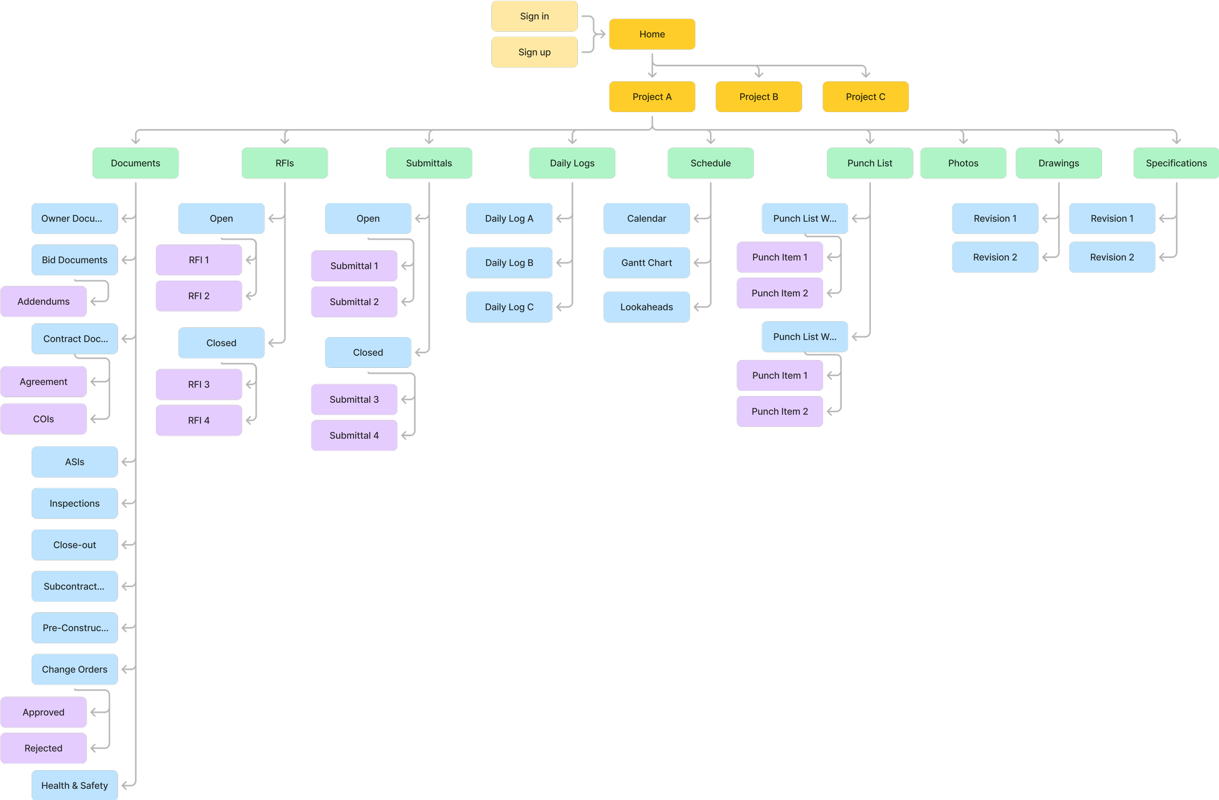
Information architecture for project management
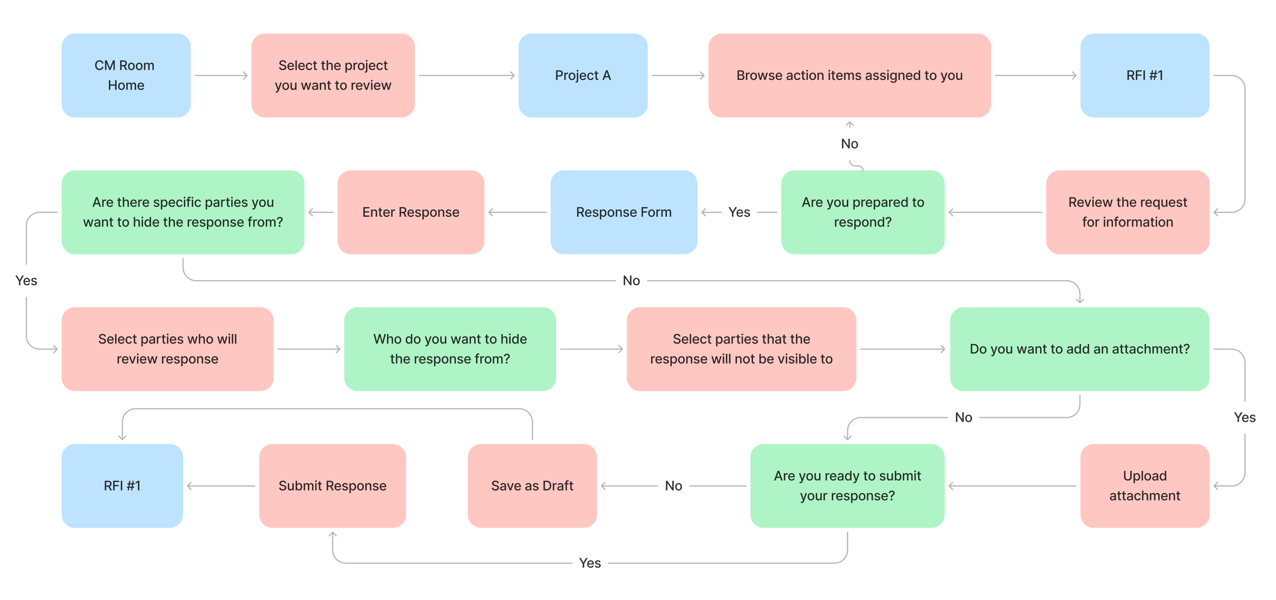
Project management requires a wide range of tools such as file management, team correspondence, and task review and approval. Developing a site map for CM Room allowed me to recognize all the essential features required for the product and organize them to ensure the structure is comprehensive yet easy to use. A user flow was developed to explore a typical task that would be completed within a project and represent how the features of this product would meet the needs identified during the research phase.
DESIGN
Sketching low fidelity wireframes to determine the MVP
Following research, which identified the product goals, and ideation, which developed the product structure, lofi wireframes were designed to begin visualizing which screens were necessary for a minimal viable product with features that fulfilled the product goals.
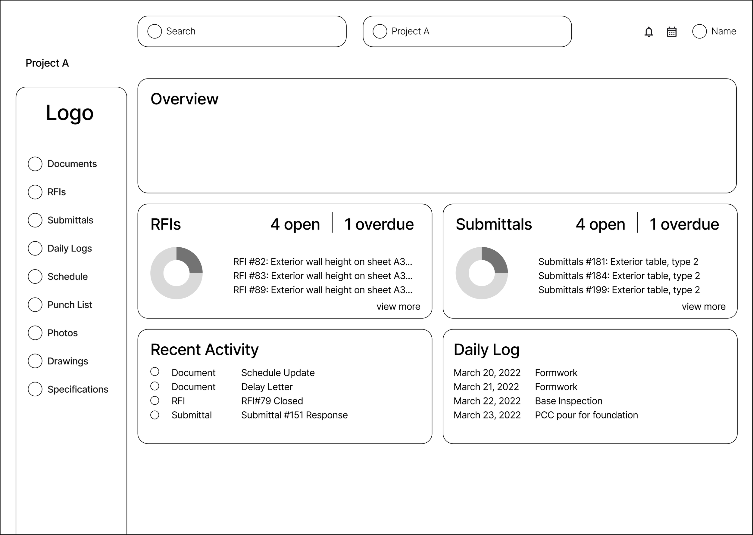
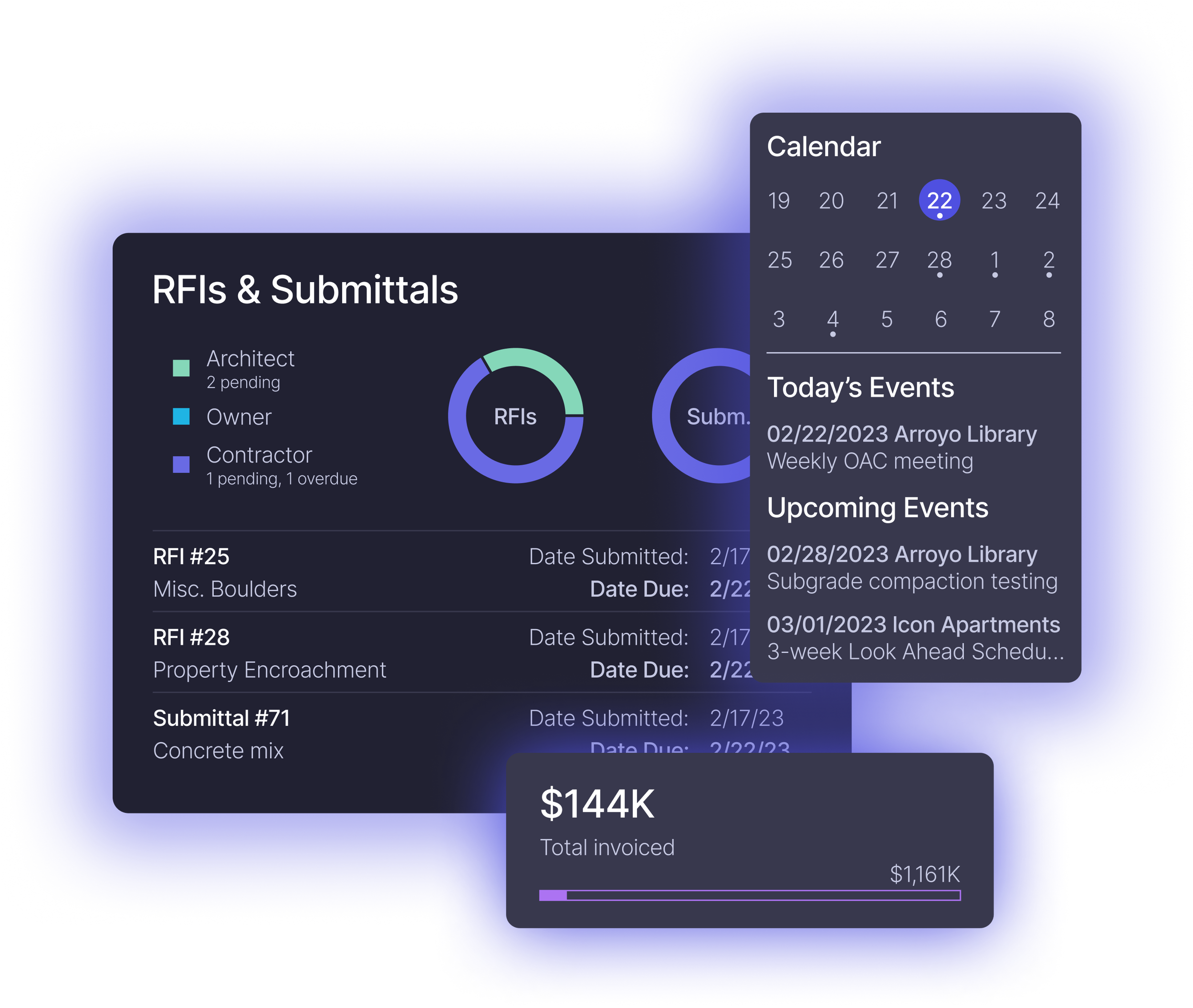
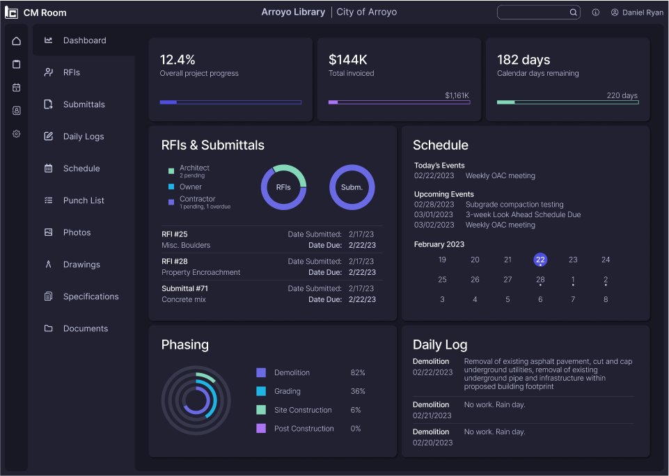
Project Dashboard
The project dashboard is a critical feature for the product in order to succinctly display the most relevant information for the project.
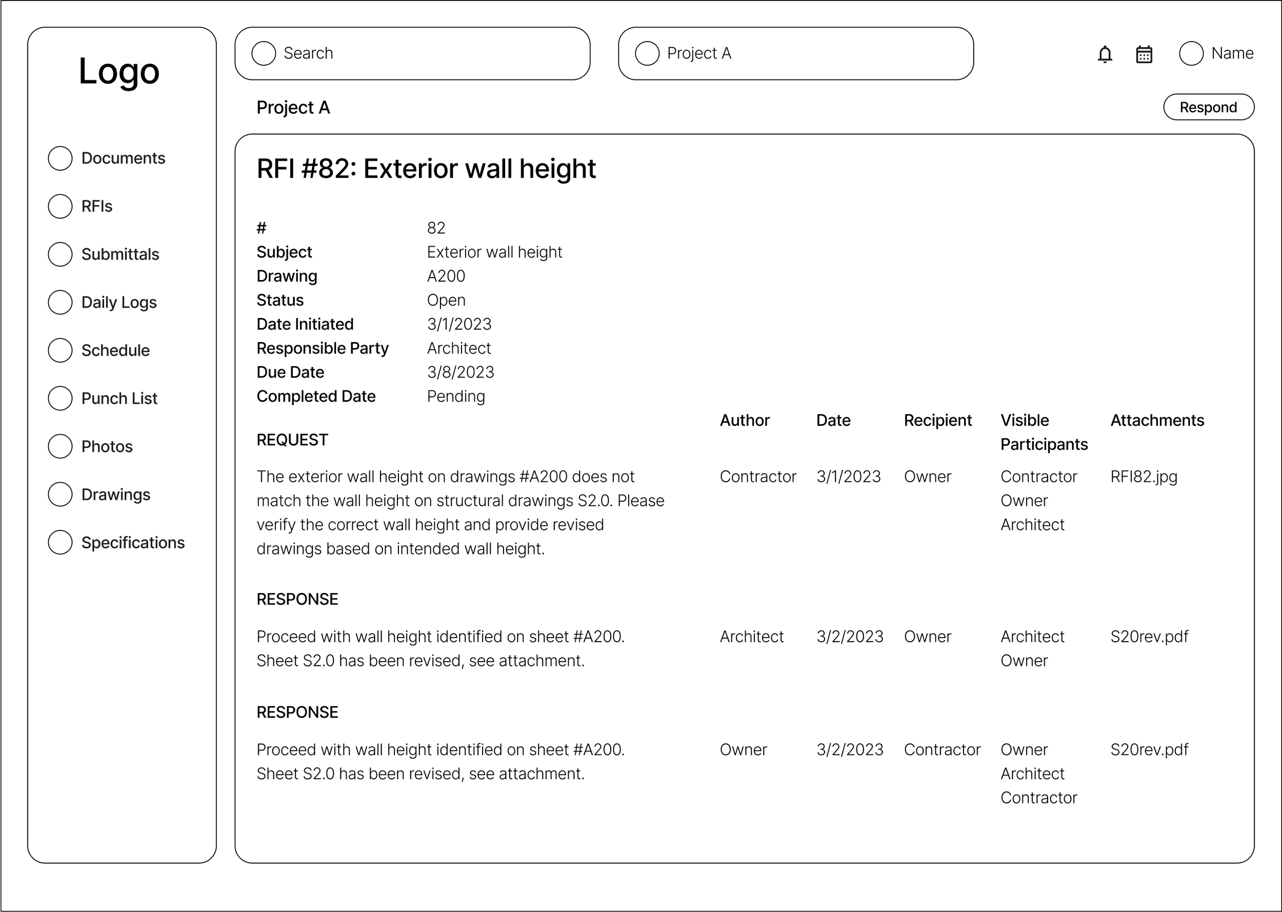
Request for Information
Clearly displaying the order of correspondence for each response provides clarity to how the final solution is reached.

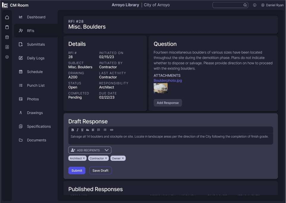
Response Form
A response form that allows the user to select recipients that the response would be visible to is important for meeting pain points identified during research.
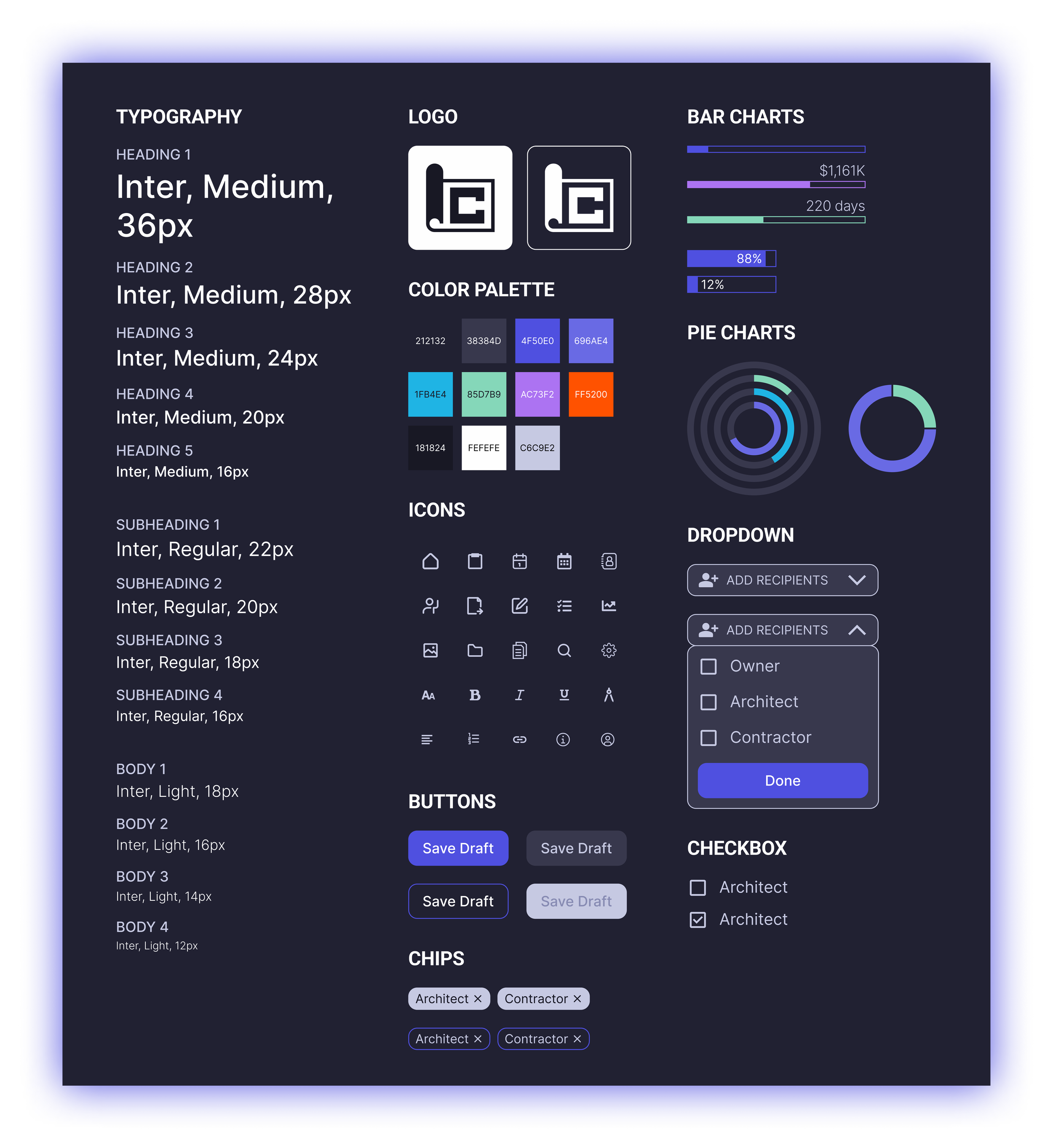
Building the brand
The name CM Room denotes the idea of having multiple parties within a space collaborating and communicating with each other to design and build a successful project. The logo resembles unrolling a set of blueprint plans, the ultimate tool of communication between designer and contractor. Dark blue, used as the primary color across the product, resembles calmness and responsibility, two essential characteristics to embrace in project management.
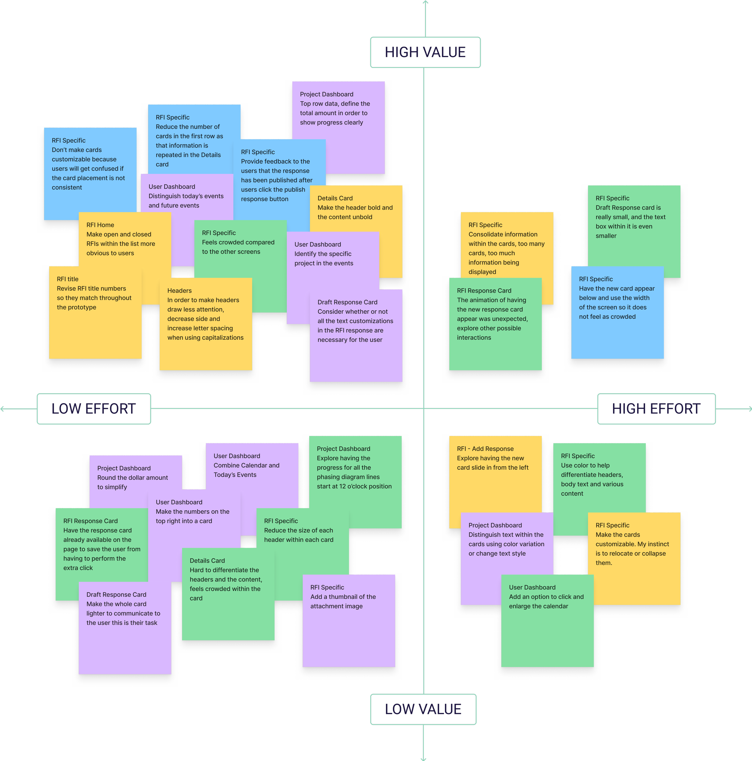
Testing the product with AEC professionals
User testing was conducted with four professionals that had experience in the AEC industry to collect feedback on the features introduced by CM Room. The following conclusions were drawn from the user test results and high value revisions were then incorporated in the design.
Users found the project dashboard very informative and communicated all the vital information necessary for project management, though simplification in some areas would further improve legibility.
The RFI response experience was met with positive input and communication between parties was clearly identified.
The user interface was visually appealing, and improvement to many other existing products on the market.Further emphasis could be made to which tasks needed attention and who’s responsibility it was to complete them.
Displaying critical information to promote task completion
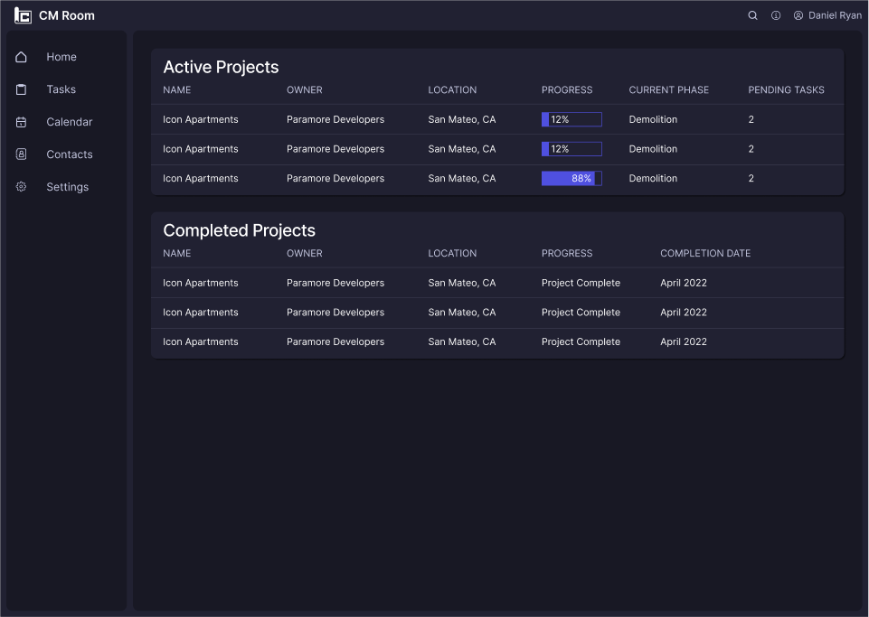
BEFORE
The user dashboard displayed on active and completed projects and the only notification for tasks was under the pending tasks column, which took time for the users to recognize.
AFTER
An additional information column was added to the right side of the screen to clearly highlight the status of tasks that required attention, in addition to upcoming events to keep the user up to date on overall project status even before opening specific projects.

Improving information graphics

BEFORE
Some users found the bar graphs under RFI & Submittals to be an off use of that particular graphic. The amount of information displayed on the dashboard, especially near the top, was a bit cluttered.
AFTER
The information graphics were revised to improve understandability and the project information at the top of the page was restructured to reduce clutter.
Emphasizing tasks that require attention
BEFORE
The matrix provided the necessary information, but due to the number of items it required careful scanning to identify who was responsible for the uncompleted tasks.
AFTER
Color coding the status and responsible party for uncompleted tasks provided further emphasis on which tasks required attention.

Reorganizing information to increase legibility
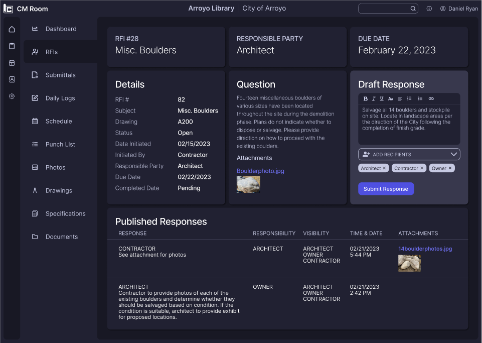
BEFORE
Users were all able to complete the task flow of responding to an information request, but feedback was received regarding the format of the page and the amount of cards could be reduced to increase legibility of information.
AFTER
The information on the page was reorganized to reduce the number of cards and the information combined to focus the user on the task at hand, which was to submit a response.
Final Design
Following user testing and design refinement, the final iterations of high fidelity screens were completed for CM room.
REFLECTIONS
Understanding the needs of professionals
Designing B2B products requires extensive research about the professionals that will be using the product and understanding the goals, needs and pain points that they experience. Hearing about the experiences of AEC professionals and the challenges they face daily with team communication and project management was critical to the product design.
Recognizing the importance of visuals
User experience and user interface are inseparable factors that contribute to a successful product. In multiple situations, the UI elements that were tested contributed to a users understanding or ability to successfully complete a given task. Using symbols and colors appropriately helped users with identifying notifications and completing tasks.